Minimalist Resume Templates
Learn how to create a minimalist resume that’s clean, professional, and ATS-friendly. Get expert tips, examples, and free resume templates to make your application stand out.
Build My ResumeOur resumes get people hired at top companies

White and grey resume template
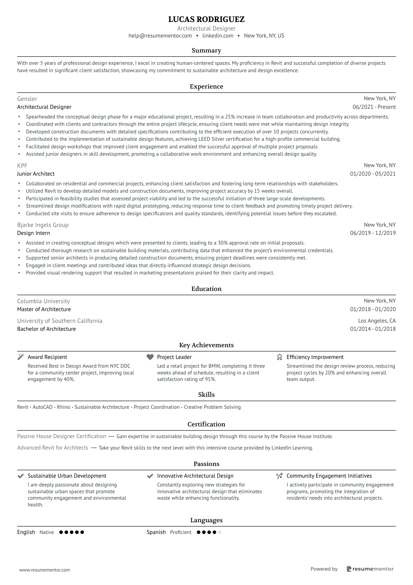
This minimalist resume blends a clean, structured layout with powerful content, making it highly effective for design professionals. The document strategically highlights key achievements, skills, and experience, ensuring recruiters can quickly grasp the candidate’s qualifications.
Key features and highlights
- Modern, well-structured layout – A professional and visually appealing format with clear sections for readability.
- Concise and compelling summary – A strong introduction emphasizing 5+ years of experience in architectural design and sustainable development.
- Experience section with quantifiable impact – Each role includes measurable achievements, demonstrating leadership, project success, and efficiency improvements.
- Key achievements section – Special highlights of major career accomplishments, making the resume stand out.
This minimalist resume supports:
- Professional fonts – Clean and ATS-friendly typography that enhances readability.
- Applicant Tracking Systems (ATS) – Optimized formatting to ensure accurate parsing by ATS software.
- Resume best practices – Adheres to industry standards for font size, section spacing, and logical content organization.
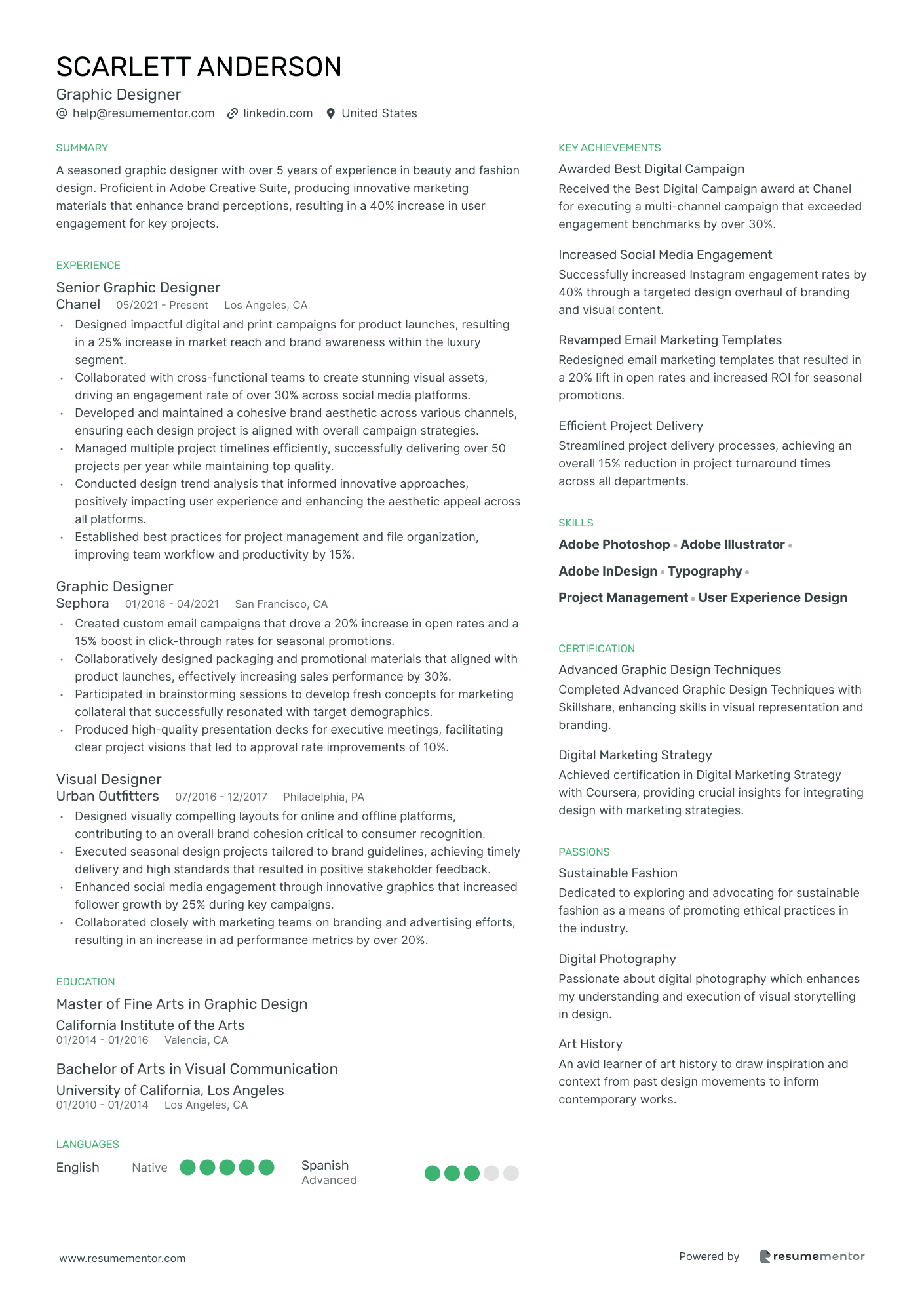

Elegant and simple color resume template
This minimalist resume is an excellent example of a well-structured, visually appealing, and content-rich document tailored for creative professionals. The combination of clean design, strong content, and quantifiable achievements makes it stand out while maintaining a professional aesthetic.
Key features and highlights
- Modern, structured layout – A clean and professional design that ensures easy readability and visual appeal.
- Engaging summary section – A strong introduction that highlights 5+ years of experience in beauty and fashion design, with an emphasis on brand enhancement and user engagement.
- Skills section with emphasis on industry tools – Highlights Adobe Photoshop, Illustrator, InDesign, and typography, reinforcing technical expertise.
- Passions section for personal branding – Showcases interests in sustainable fashion, digital photography, and art history, adding personality and depth.
This minimalist resume supports:
- Professional fonts – A balance of clean, modern typefaces that enhance readability.
- Applicant Tracking Systems (ATS) – ATS-friendly structure ensures proper parsing and keyword optimization.
- Resume best practices – Maintains industry standards for section spacing, font size, logical content flow, and readability.
When a hiring manager looks at your resume, they don’t have time to waste. In just a few seconds, they’ll decide whether to keep reading or move on. If your resume is cluttered or difficult to scan, they might not get to the part that actually proves you’re the right fit. A minimalist resume ensures that never happens—it puts your qualifications front and center, without distractions.
By stripping away unnecessary design elements, a minimalist resume makes your skills, experience, and accomplishments easier to find. It’s not just about looking clean; it’s about making sure the right information stands out. When recruiters can quickly see what you bring to the table, your chances of landing an interview go up.
Beyond readability, a minimalist approach also improves how your resume is processed by applicant tracking systems (ATS). These systems don’t reject resumes outright, but they do categorize and rank them based on relevance. The simpler your formatting, the more accurately ATS can extract your information, ensuring your resume reaches the right decision-makers.
More than just a trend, minimalist resumes work across industries. Whether you’re applying for a job in tech, finance, or design, a clean and structured layout signals professionalism. It shows you understand what’s important—your qualifications, not flashy graphics.
In this guide, we’ll break down exactly how to create a minimalist resume that helps you stand out. You’ll learn what to include, what to leave out, and how to format it for both humans and hiring software. By the end, you’ll have a resume that’s simple, effective, and ready to get you noticed.
Key takeaways
- A minimalist resume is designed for clarity and impact, making it easy for recruiters to scan and understand your qualifications quickly.
- A well-structured layout is essential—use clear headings, professional fonts, and balanced whitespace to create a polished look.
- Keep your resume concise by focusing on achievements, not just responsibilities. Aim for one page unless you have extensive experience.
- Optimize for ATS by using standard section headings, avoiding complex formatting, and integrating relevant keywords from job descriptions.
- Strong action verbs make a difference—start each bullet point with a powerful verb and, whenever possible, include measurable results.
- Avoid common mistakes like over-simplifying, using hard-to-read fonts, failing to tailor your resume to each job, or overloading it with too many minimalist design elements.
- A minimalist resume works across industries and helps you stand out in competitive job markets by highlighting what truly matters.
- Simplicity doesn’t mean basic—a well-designed minimalist resume balances professionalism with readability, ensuring both ATS and human recruiters can process it efficiently.
What is a minimalist resume
A minimalist resume is designed to do one thing exceptionally well—make your qualifications stand out without distractions. When recruiters review applications, they don’t have time to dig through cluttered layouts or excessive details. They need to quickly understand who you are and what you bring to the table. A minimalist resume makes this easy by using clean formatting, clear section headings, and consistent spacing to guide the reader’s eye straight to the most important details.
What makes this approach so effective is its emphasis on clarity. Instead of using flashy colors, decorative fonts, or unnecessary design elements, it relies on structure and whitespace to create a refined, professional look. This simplicity isn’t just about aesthetics—it ensures that recruiters can absorb key information at a glance. When your resume is easy to read, it feels more polished and makes a stronger impression.
A minimalist resume also helps avoid common design mistakes. Traditional resumes can sometimes feel dense, packed with long paragraphs and inconsistent formatting that make them harder to scan. On the other hand, resumes that lean too heavily on creative design—like those with bold colors, icons, or graphics—can shift focus away from content or even cause issues with applicant tracking systems (ATS). These systems don’t filter resumes out, but they do categorize and rank applications based on relevance. A minimalist format ensures that your information is processed correctly, helping you stay competitive in the hiring pool.
But the real power of a minimalist resume goes beyond readability and ATS compatibility—it signals confidence. When you strip away unnecessary fluff, you’re telling employers: I know what matters. You’re showing that you can communicate effectively, focus on essentials, and present yourself in a way that’s both polished and professional. In a job market where first impressions happen in seconds, that kind of clarity can set you apart.
Why choose a minimalist resume
A minimalist resume isn’t just about looking polished—it’s about making your qualifications instantly clear. When recruiters review resumes, they scan for key details in seconds. A clean, structured layout helps them find what they need without distractions, ensuring your most important information stands out.
Readability is one of the biggest advantages of a minimalist design. When your resume has clear headings, consistent spacing, and well-defined sections, recruiters can quickly grasp your experience and skills. Instead of getting lost in cluttered formatting or unnecessary graphics, they can focus on what truly matters—your qualifications. And when reading your resume feels effortless, you leave a stronger impression.
This simplicity also benefits applicant tracking systems (ATS). These systems categorize and rank resumes based on relevance, helping recruiters filter through large applicant pools. Overly designed resumes with graphics, columns, or unusual fonts can confuse ATS software, making it harder for your details to be accurately indexed. A minimalist format ensures your information is correctly processed and positioned where it should be.
But beyond readability and ATS compatibility, a minimalist resume sends a powerful message—it shows confidence. By keeping your design simple, you demonstrate that you know what’s important and don’t need flashy elements to make an impact. This kind of clarity and professionalism signals to employers that you’re thoughtful, efficient, and focused—qualities that matter in any job.
✅ Advantages
- Easy to read – Clean formatting and clear section headings make it simple for recruiters to scan your resume quickly.
- ATS-friendly – Simple text-based formatting ensures that applicant tracking systems (ATS) can properly categorize and process your information.
- Professional look – A minimalist resume gives off a polished and modern appearance, making a strong first impression.
- Focuses on content – With no unnecessary design elements, the emphasis stays on your skills, experience, and achievements.
- Works across industries – Whether you’re in tech, finance, design, or marketing, a minimalist resume is universally accepted and appropriate.
- Prevents clutter – By eliminating excessive details, your resume remains structured and easy to digest.
- Saves space – A minimalist design helps keep your resume concise, fitting all key information on one page without feeling cramped.
❌ Disadvantages
- Might look too plain – Some employers in creative fields may prefer resumes with more visual appeal, especially for design-heavy roles.
- Can feel generic – If not customized properly, a minimalist resume may lack personality or fail to stand out from other applicants.
- Limited use of design elements – While simplicity is a strength, it also means you can’t rely on color, icons, or graphics to highlight key information.
- Requires strong content – Since there are no flashy design elements, the success of a minimalist resume depends entirely on well-written descriptions and relevant experience.
Key components of a minimalist resume
- A minimalist resume isn’t just about looking clean—it’s about making your qualifications instantly clear. When a recruiter scans your resume, they should be able to find key details effortlessly. A well-structured design ensures they don’t waste time searching for the information that matters most.
- That structure starts with a clear layout. Each section—contact information, experience, skills, and education—should be easy to locate, flowing naturally from one to the next. When information is arranged logically, recruiters can absorb it in seconds, increasing your chances of making an impact.
- A key part of that readability is font choice. Simple, professional typefaces like Lato, Raleway, or Rubik make your text easy to skim, ensuring recruiters don’t struggle with decorative or hard-to-read fonts. A clean font not only improves legibility but also reinforces a professional, modern look.
- Equally important is whitespace, which helps prevent your resume from feeling cluttered. Proper margins and spacing give each section breathing room, allowing recruiters to navigate the page without visual overload. A resume packed with dense text can be overwhelming, while strategic spacing makes key points stand out.
- To further enhance clarity, a neutral color scheme keeps the focus where it belongs—on your qualifications. Black, white, and shades of gray create a polished, distraction-free design. If you choose to add color, it should serve a purpose, such as subtly differentiating section headings while maintaining a sleek, professional feel.
- Finally, bullet points break down information into digestible pieces. Instead of lengthy paragraphs, concise bullet points highlight achievements and responsibilities in a format that’s easy to scan. This ensures that the most relevant details stand out, even at a quick glance.
How to create a minimalist resume (step-by-step)
As we already mentioned, a well-crafted minimalist resume isn’t just about looking clean—it’s about making sure your qualifications are easy to read and process. Every element should serve a purpose, ensuring that recruiters can quickly find what they need without distractions. The right approach balances simplicity with structure, making your resume effective for both human reviewers and applicant tracking systems (ATS).
Choose the right template
Your resume’s design should work for you, not against you. A well-structured template ensures your information is easy to read, professionally presented, and free of distractions. If a recruiter struggles to navigate your resume, they may move on before even reading your qualifications. A minimalist template eliminates this risk by keeping everything clean, organized, and effortless to scan.
The best minimalist resumes focus on clarity and balance. Every element—fonts, section headings, and whitespace—should guide the reader’s eye naturally.
Use ResumeMentor.com and choose from their well-designed templates that do this effectively, ensuring consistency without unnecessary embellishments.
When selecting a template, look for one that:
- Uses professional fonts like Lato, Raleway, or Rubik to ensure readability.
- Has bold, well-defined section headings that make key information easy to find.
- Avoids distracting design elements, such as unnecessary borders, bright colors, or heavy graphics.
- Maintains balanced whitespace to create a structured, easy-to-scan layout.
A black-and-white minimalist resume is a great choice if you want a sleek, professional look. However, minimal doesn’t mean dull—your resume should feel polished, not unfinished. The goal is to create a design that enhances readability, not one that feels empty or plain.
Once you’ve chosen a template, commit to it. Making unnecessary tweaks to fonts, spacing, or colors can throw off the structure and make your resume harder to read. A strong minimalist resume looks intentional and effortless, signaling professionalism at first glance. When hiring managers only have seconds to decide, that first impression can make all the difference.
How to structure a minimal resume effectively
Recruiters spend only a few seconds scanning each resume, so your layout should guide their eyes effortlessly to the most important details. A structured approach ensures they can instantly understand who you are and why you’re a strong candidate.
Your header should contain the essentials
A resume header on a minimalist resume should be straightforward, containing only your name, phone number, email, and LinkedIn profile. Avoid unnecessary details like your full mailing address—just your city and state are enough.
A summary or objective should set the tone
A resume summary is ideal if you have experience—it highlights your expertise in a few compelling sentences. If you’re a recent graduate or changing careers, an objective statement can briefly outline your goals and what you bring to an employer. Keep it specific and tailored to the role.
Your work experience should focus on impact
Your work experience should highlight achievements, not just responsibilities. Use bullet points and quantify results whenever possible to show measurable impact.
 01/2020 - Present
 - •Increased engagement by 40% through data-driven content strategy.
- •Grew Instagram followers from 5K to 20K in 12 months.
- •Led a team of three and improved campaign efficiency by 30%.
The skills section should be tailored and relevant to the job you’re applying for
Instead of listing generic skills, focus on industry-specific or technical abilities that match the job description. If applicable, categorize them to improve readability.
Your education and certifications should be clear and direct
Your education section should be concise and relevant. If you’re a recent graduate, you can include relevant coursework, but avoid listing every class you’ve taken.
01/2022 - 01/2022 Additional sections that can add value without clutter
Extra sections should only be included if they strengthen your resume. Projects, volunteer work, and awards can provide additional credibility, but keep them brief and relevant.
Invalid Date - Invalid Date Keep it concise
A minimalist resume is powerful because it gets straight to the point. It strips away unnecessary fluff and highlights the most important details—your skills, experience, and achievements. Every word should serve a purpose, and every section should add value.
Stick to one page (when possible)
For most job seekers, a single-page resume is the best approach. Recruiters scan resumes quickly, and long documents often lose their attention. If you have less than ten years of experience, aim to fit everything on one well-structured page. If you’re a senior professional, a second page is acceptable—but only if it’s necessary to showcase high-impact experience.
Prioritize impact over description
Your resume isn’t just a job history—it’s a proof of impact. Instead of listing generic responsibilities, focus on achievements that show measurable results. “Managed social media” is forgettable. “Increased engagement by 40% through targeted campaigns” tells a recruiter exactly why you’re valuable. Make each bullet point work hard to prove your worth.
Trim the fat
Recruiters don’t need to see your full mailing address, outdated skills, or jobs from 15 years ago that don’t relate to your current career. Remove anything that doesn’t support your application. Your resume should be a highlight reel, not a full autobiography.
Use clear, concise language
Every sentence should be sharp and direct. Replace long-winded explanations with short, impactful statements. Avoid filler words like “responsible for” or “duties included.” Instead, start with strong action verbs and let your accomplishments do the talking.
Optimize for ATS
A minimalist resume isn’t just about looking clean—it’s about making sure your information gets seen. Many companies use Applicant Tracking Systems (ATS) to sort and rank resumes before they ever reach a hiring manager. If your resume isn’t formatted correctly, key details might be misread or overlooked. Optimizing for ATS ensures your qualifications are recognized, helping you stay in the running.
Use standard section headings
ATS software scans resumes by looking for familiar section titles. If you use creative labels like “My Career Journey” instead of “Work Experience”, the system might not categorize your information correctly. To avoid this, stick to universally recognized headings:
- Work Experience
- Education
- Skills
- Certifications
Keeping it simple ensures both the ATS and human recruiters can quickly find what they need.
Keep the formatting clean
Minimalist resumes naturally align with ATS best practices because they avoid complex formatting. But even with a simple design, you need to be mindful of how ATS reads your resume. Fancy layouts with multiple columns, text boxes, or graphics may look good to the human eye but can scramble your information when processed by some software if your resume isn’t properly structured (this is something that we take care of with our resumes).
To avoid issues, follow these guidelines:
- Use a single-column or double-column format so ATS reads your resume in the correct order. Also, ensure that the resume building software structures the PDF file properly.
- Stick to professional fonts like Lato, Arial, or Rubik.
- Avoid tables, images, or decorative elements—some ATS systems often can’t interpret them properly.
A clean, well-structured layout helps your resume get past the software and in front of real decision-makers.
Use the right keywords
ATS ranks resumes based on relevance to the job description. If you don’t include the right skills and industry-specific terms, your resume might not score high enough to make it through the system—even if you’re a perfect fit for the job.
To tailor your resume with the right keywords you need to
- Read the job description carefully and identify important skills and keywords (e.g., “data analysis,” “project management,” “Python”).
- Naturally integrate these terms into your resume, especially in the skills and work experience sections.
- Avoid keyword stuffing—recruiters will notice if you just list terms without context.
Think of it like this: the ATS helps recruiters find the best matches, but it can only work with what it’s given. If your resume speaks the same language as the job posting, it has a better chance of ranking higher.
Submit the right file format
Most job applications accept PDFs, as they preserve your resume’s structure across different devices. However, some ATS systems request Word documents instead. Always check the job listing for specific file format instructions—following them ensures your resume gets processed correctly.
Why this matters
A minimalist resume already makes your qualifications easy to read. When you combine that with ATS-friendly formatting, you remove barriers that could prevent your resume from being seen. The goal isn’t just to look polished—it’s to ensure that both software and recruiters can quickly recognize your value.
Use strong action verbs
The words you choose in your resume can make the difference between blending in and standing out. Strong action verbs instantly add clarity, confidence, and impact to your achievements. Instead of passively describing what you did, they show recruiters the results you delivered.
Why action verbs matter
Recruiters don’t just want to know what your job responsibilities were—they want to see how you made a difference. Action verbs help paint a clearer picture of your contributions by emphasizing results. Compare these two bullet points:
🚫 Responsible for managing a team of sales representatives.
✅ Led a team of 10 sales reps, increasing revenue by 25% in six months through targeted sales strategies.
The second one is stronger, more specific, and achievement-focused—all thanks to a well-chosen verb.
Start every bullet point with an action verb
Each bullet point in your work experience section should begin with a verb that highlights your impact. Here are some powerful choices, depending on the skill you want to showcase:
Action verbs that you can use to start a bullet point
- Leadership & Management: Led, Supervised, Directed, Mentored, Spearheaded
- Problem-Solving & Strategy: Analyzed, Optimized, Implemented, Resolved, Streamlined
- Achievement & Impact: Increased, Improved, Accelerated, Reduced, Boosted
- Collaboration & Communication: Coordinated, Negotiated, Facilitated, Advised, Presented
- Innovation & Development: Developed, Designed, Launched, Engineered, Initiated
Using the right verb helps recruiters visualize your contributions rather than just reading a list of duties.
Make your accomplishments measurable
Whenever possible, pair strong action verbs with quantifiable results. Numbers add credibility and make your achievements more tangible.
- •Implemented a new onboarding process that reduced training time by 30%, allowing employees to become productive faster.
- •Optimized paid ad campaigns, increasing lead generation by 50% while reducing cost per acquisition by 20%.
- •Developed an internal knowledge base that cut support ticket resolution time by 40%, improving customer satisfaction scores.
- •Spearheaded a content marketing strategy that drove 100K+ organic visitors in six months.
- •Revamped product packaging, leading to a 15% increase in retail sales within three months.
These statements feel more concrete than simply saying “Managed training” or “Worked on ad campaigns.” The key is specificity—what you did, how you did it, and the impact it had.
Avoid weak and vague language
Phrases like “Assisted with,” “Helped,” or “Was involved in” weaken your message. They make your contributions sound passive rather than proactive. Instead, focus on what you personally achieved and use verbs that convey action and ownership.
🚫 Helped organize company events.
✅ Planned and executed quarterly company events, increasing employee engagement by 20% and boosting retention rates.
🚫 Worked on customer service improvements.
✅ Redesigned customer support workflow, reducing response times by 50% and improving customer retention by 12%.
🚫 Assisted in creating marketing campaigns.
✅ Designed and launched a targeted email campaign that increased conversions by 35%.
Minimalist resume examples and samples
A minimalist resume is all about clarity, professionalism, and readability. Below, you’ll find minimalist resume examples with simple yet effective resume designs that help job seekers stand out while keeping things clean and focused.
Graphic designer minimalist resume examples
Architect minimalist resume examples
Common mistakes people make when creating a minimal resume (you should avoid those)
A minimalist resume can be a powerful tool—but only if it’s done right. While simplicity improves readability, going too far can make your resume look empty or ineffective. Here are some common mistakes to watch out for and how to avoid them.
- Over-simplifying and omitting key details
Minimalism doesn’t mean cutting out important information. Some job seekers remove too much, leaving out key achievements, job descriptions, or even a summary. Your resume should be clean, but it still needs to tell your professional story. Focus on impact—keep it concise, but make sure recruiters understand what you did and why it mattered. - Using an inappropriate font or excessive whitespace
The right font should be professional and easy to read. Overly stylized fonts, like script or decorative typefaces, can make your resume look unprofessional or hard to scan. Similarly, excessive whitespace can make your resume feel empty or unfinished. Balance is key—use readable fonts like Arial or Calibri and structure your layout so that there’s enough space to breathe, but not so much that it looks sparse. - Failing to tailor your resume to specific jobs
A minimalist design won’t save a resume that feels generic. Some job seekers assume a simple layout is enough, but customization matters more than ever. Always adjust your resume to match the job description by incorporating relevant keywords, emphasizing the most important skills, and making sure your experience aligns with what the employer is looking for. - Overloading the resume with too many minimalist design elements
Some people overdo minimalism by using ultra-thin fonts, light gray text, or excessive icons, which can make the resume harder to read. A truly effective minimalist resume balances simplicity with clarity. Stick to a strong contrast (black or dark gray text on a white background), readable font sizes, and a logical structure that naturally guides the reader’s eye.
In conclusion
A minimalist resume isn’t just about design—it’s about making sure your qualifications are easy to read and impactful. By keeping your layout clean and your content focused, you help recruiters find the information they need in seconds. A well-structured, clutter-free resume gives you a professional edge and improves your chances of getting noticed.
Minimalism also ensures your resume is ATS-friendly, increasing the likelihood that it gets through automated screening systems. When you remove unnecessary elements and focus on clear, concise writing, your resume becomes both readable and effective. Every section serves a purpose, and every word adds value.
If you’re looking to make a strong impression with less effort, now is the time to simplify. A minimalist resume helps you present your experience with confidence, making your job application stand out for all the right reasons.
More nuanced facts about minimalist resumes
What is a minimalist resume, and why should I use one?
A minimalist resume focuses on clean design, clear structure, and concise content, making it easy for recruiters to scan quickly. It removes unnecessary design elements, ensuring that your skills and experience stand out. This type of resume is ideal for professionals who want a polished, distraction-free layout that works well for both human recruiters and applicant tracking systems (ATS).
Are minimalist resumes ATS-friendly?
Yes! In fact, minimalist resumes are often more ATS-friendly than heavily designed resumes. Since ATS software scans text-based content, resumes with simple formatting, clear section headings, and standard fonts are easier to read and categorize correctly. Avoid columns, tables, and excessive styling to maximize ATS compatibility.
Will a minimalist resume make me look unoriginal?
Not at all! A minimalist resume isn’t about making every resume look the same—it’s about removing distractions so your unique experience and skills take center stage. You can still customize your resume with strategic font choices, subtle design elements, and content that highlights your personality and expertise.
Can I use a minimalist resume for creative jobs like graphic design or marketing?
Yes, but with a balance. While creative roles often allow for more visual resumes, many designers still opt for minimalist layouts to keep the focus on their portfolio and work experience. If you’re in a creative industry, you can pair a minimalist resume with a well-structured portfolio link to showcase your design skills separately.
How do I choose the best minimalist resume template?
Look for templates that prioritize readability, structure, and professionalism. The best minimalist templates should have:
- A single-column layout for easy scanning.
- Clear section headings to highlight key information.
- Professional fonts like Lato, Raleway, or Rubik for readability.
- Balanced whitespace to prevent clutter.
What colors should I use in a minimalist resume?
Minimalist resumes typically use a black, white, and gray color scheme to maintain a clean, professional look. However, subtle accent colors (such as deep blue or muted pastels) can be used sparingly to enhance structure without overwhelming the content. Avoid overly bright colors that can be distracting.
What are common mistakes to avoid when creating a minimalist resume?
- Over-simplifying your content – Don’t cut too much information; your resume still needs depth.
- Using ultra-thin fonts or light gray text – Keep it readable and high-contrast.
- Failing to tailor your resume to each job – A minimalist design doesn’t replace customization for each application.
- Leaving too much whitespace – A clean design is good, but an empty resume can look unfinished.
Should I use a one-page minimalist resume?
For most job seekers, one page is ideal—especially if you have less than 10 years of experience. However, senior professionals or those with extensive projects and leadership roles may need two pages. The key is to ensure every section adds value and isn’t just filling space.
What’s the best file format for a minimalist resume?
A PDF file is the best format for submitting your resume because it preserves formatting across different devices and ensures compatibility with ATS. However, if a job posting specifically requests a Word document, follow the instructions to avoid technical issues.
Resume
Resources
Tools
© 2026. All rights reserved.
Made with love by people who care.