How to Choose the Best Resume Format in 2025

Aug 15, 2024
|
12 min read
Instantly boost your chances of job search success by choosing the perfect resume format.
First impressions matter. When a hiring manager reviews your application, the first thing they’ll notice is the resume format. If it’s chaotic and difficult to read, chances are your resume will end up in the trash.
What’s more, you don’t have long to get it right. Recruiters typically spend seven seconds or less reviewing each new resume. Luckily, selecting the perfect resume format will help you grab their attention and boost your chances of landing an interview.
In this article, we’ll discuss the following:
- The three most popular resume formats–chronological, functional, and combination (or hybrid).
- What the U.S. standard resume format is and when you should use it.
- How to master the look of your resume including font and margin sizes.
- Additional tips and advice on how to choose the ideal format.
Different resume format types
Let’s take a look at the three main types of resume format; chronological, functional, and combination. Understanding each of these structures–and when to use them–is vital if you want to win over the hiring manager.
Check out our definition of each of them below.
Reverse-chronological resume format (U.S. resume format)
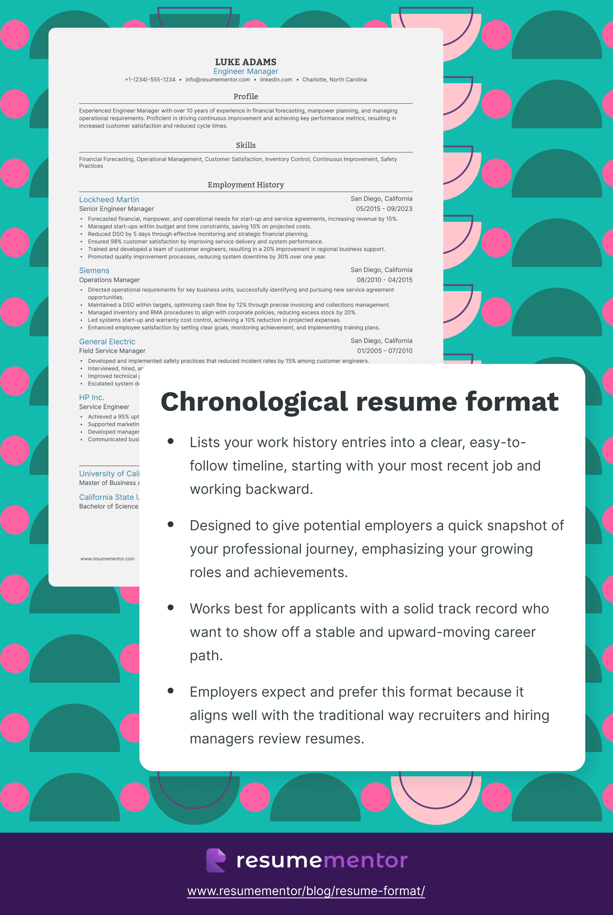
First up, it’s the U.S. standard resume format. It’s commonly known as the reverse-chronological resume format, or simply the chronological resume format. Boasting a straightforward structure, this approach showcases your professional experience and education in a balanced way.
The reverse-chronological structure starts with your most recent accolades at the top of the page and works backward in time.
Here’s a breakdown of how the structure works:
- Resume header: Within the resume header, include your basic contact details. Also list your resume headline and any links (e.g. a portfolio or LinkedIn link).
- Resume summary or objective: Include an objective or summary statement. In around three sentences, outline your accomplishments and value to the reader.
- Professional experience: Detail your prior professional positions in reverse chronological order.
- Education section: Once again, list your degrees and certifications in reverse chronological order.
- Relevant skills: Your skills section will include your hard (technical) skills and soft skills that align with the demands of the vacancy you’re applying for.
- Additional information: Although optional, you can strengthen your resume with a section on volunteer work, special interests, or hobbies.
When to use the reverse-chronological resume format
The reverse-chronological structure is what hiring managers expect to see. It’s also the standard approach in the U.S. As such, it’s best for professionals who’ve had traditional and linear career paths. It gives the reader a quick snapshot of your professional journey.
If you boast a solid track record and you’re climbing the career ladder, using this resume format is the right move. You can instantly share this information with the reader in an easy-to-follow layout.
Reverse-chronological resume format pros
- Standard resume format: There are no surprises for the reader. Hiring managers will typically favor this type of structure as it’s familiar.
- Easy to understand Hiring managers don’t have time to spare and this format delivers the main information quickly and easily.
- Highlights stability: The chronological resume format showcases your stability in your industry, which is valued by employers.
- Logical career progression: Ideal for crafting a clear professional story. It allows you to show how this vacancy is the logical next step in your career progression.
Reverse-chronological resume format cons
- Rigid structure While the chronological resume format works for most traditional candidates, it can be somewhat rigid. If you’re switching careers, for example, it’s hard to show your value.
- Emphasizes gaps This format draws more attention to gaps in your professional history than other structures.
- Highlights job-hopping If you’ve held many short-term roles, the chronological resume format will highlight this fact. That can make you look unreliable to an employer.
- Less focus on skills: If skills are your strong suit, this format can be restrictive as it places more emphasis on your professional experience and education.
Functional resume format
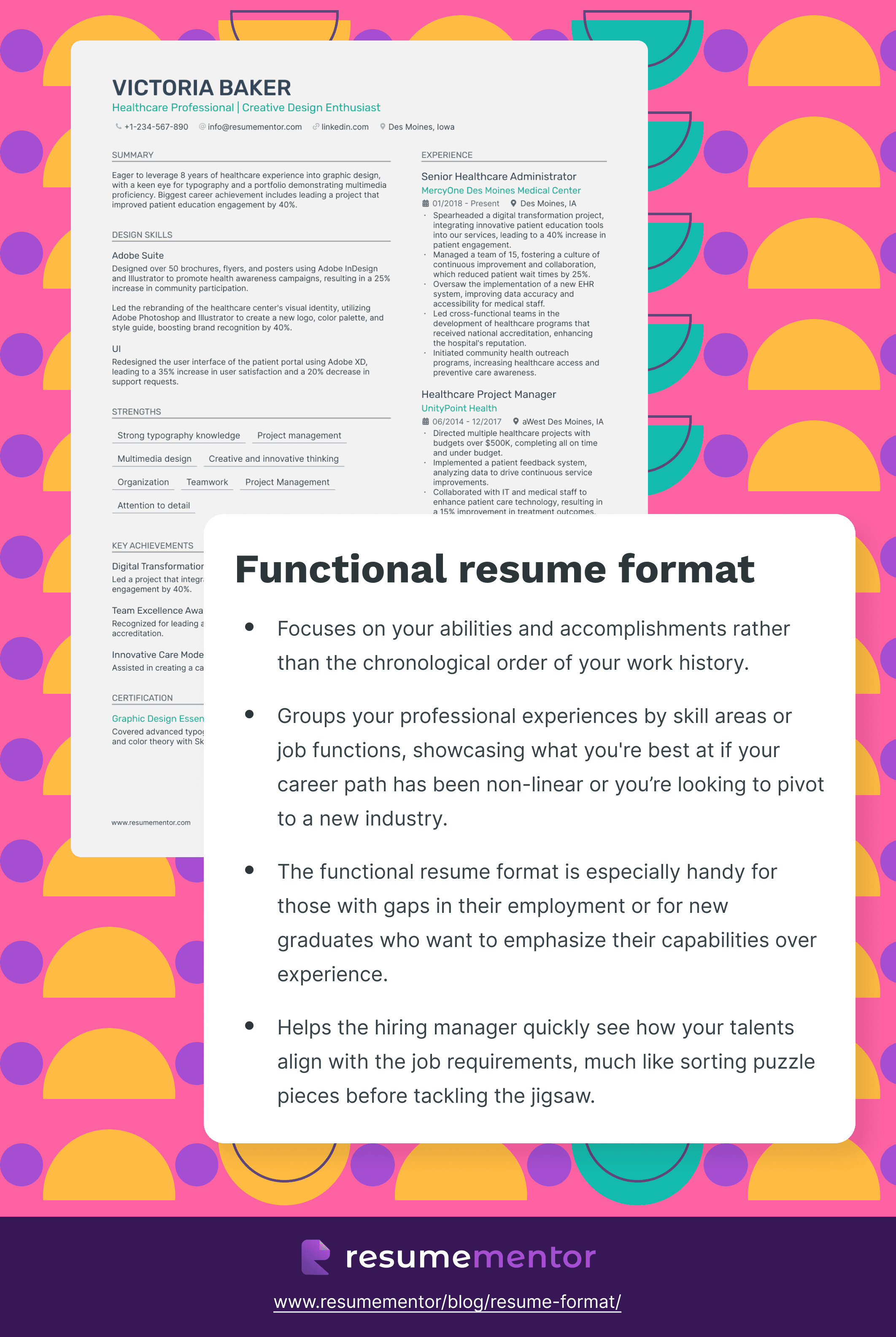
Does your impressive skill set outshine your professional experience? If so, you might prefer to use the functional resume format. This approach groups your experiences by either job function or competency. It’s best for talented individuals who want to showcase their skills front and center.
Since this isn’t the standard U.S. resume format, you may be less familiar with it. Luckily, we have you covered.
Let’s take a quick look at how this structure looks:
- Contact information. This information remains comfortably in your resume header at the top or side of the layout.
- Objective (or summary statement). Include an objective or summary statement that positions you as a prime candidate for the vacancy at hand.
- Relevant skills. Next, this format includes a summary of relevant skills. So, you have more space to share the competencies under your belt.
- Work experience. Your experiences are grouped by job function or skill, meaning you only need to dedicate a small amount of space to this section.
- Education. Your education section will again follow the reverse chronological order.
- Additional information. You may choose to add additional sections that support your application if relevant and space allows.
When to use the functional resume format
Since this structure focuses on your strengths rather than your experience, it can be ideal for freelancers and consultants. Equally, professionals who’ve held many positions or are choosing to change careers may find that this format is right for them.
You should use a functional resume format when the traditional, chronological one doesn’t suit your needs. The layout showcases your professional prowess without putting too much weight on your experiences.
Functional resume format pros
- Highlights talents If you’ve honed a skill set and want to show it off, this may be the best resume format for you.
- Minimizes gaps If you have gaps in your resume, you might worry that employers will look down on you. The functional resume format minimizes these career pauses.
- Focuses on achievements It’s not about the positions you’ve held, but the achievements you’ve made in each of them. This format gives ample space to your accomplishments.
- Easy to tailor: It’s always important to tailor your resume to the job at hand. When you use a functional format, this process is straightforward.
Functional resume format cons
- Lacks specific details Some employers may believe that you’re being purposely evasive when you use this resume format.
- Not traditional Hiring managers may have a preference for the traditional reverse chronological structure over functional.
- Confusing chronology While the reader will be able to see your skills and achievements, they may struggle to understand when and where certain things happened.
- Tricky to optimize: A functional resume format can be more challenging for ATS to optimize.
Combination resume format
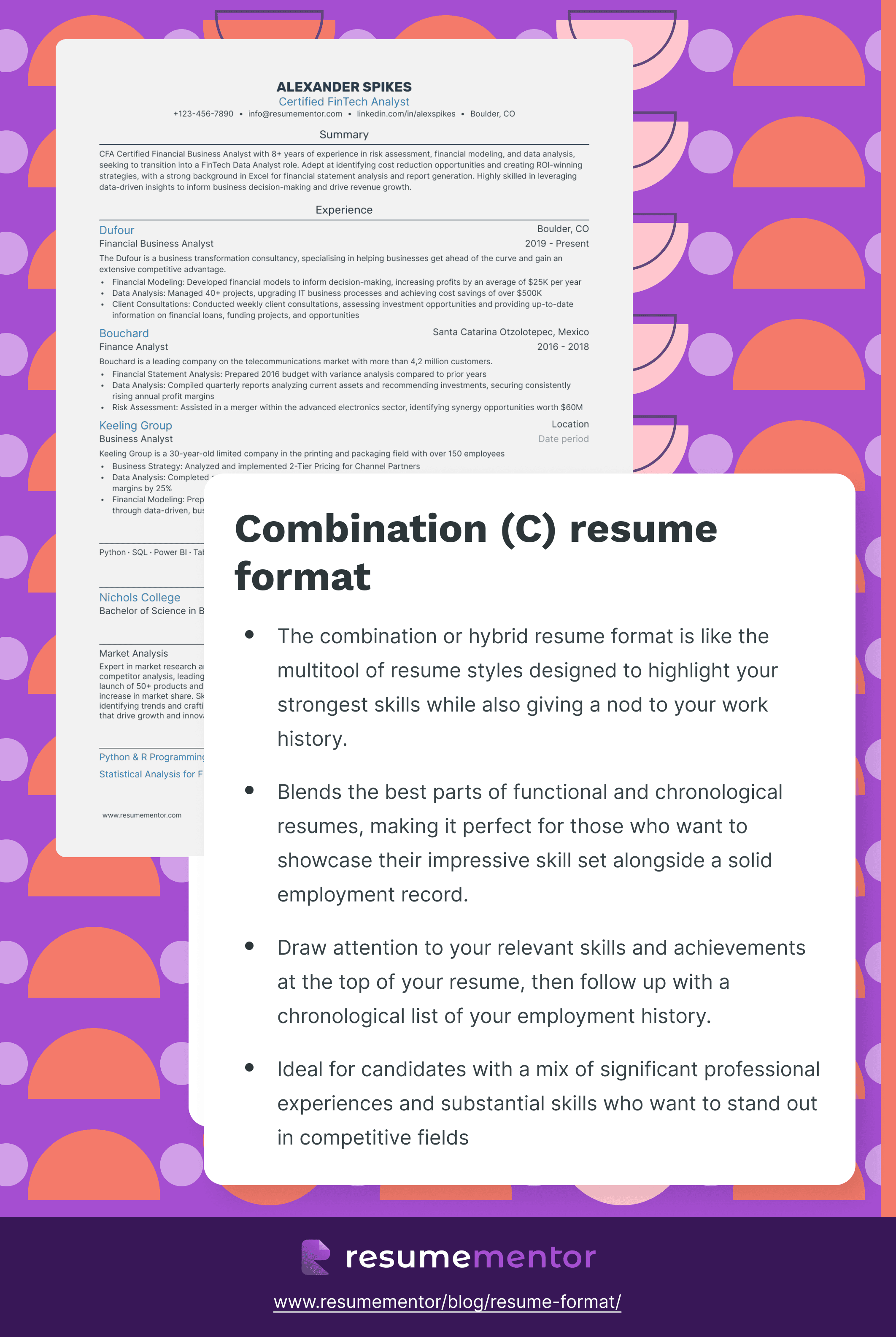
Struggling to decide whether to use the chronological or functional resume format? There’s a third option. As the name suggests, the combination resume combines the best elements of the two.
This is the best resume format if you want to emphasize your skills primarily but also clearly outline your professional experience.
Here’s a breakdown of this format’s structure:
- Contact information Your basic contact information will sit in your resume header.
- Objective (or summary statement) Be sure to tailor this freeform section to the job vacancy.
- Relevant skills The skills section of a functional resume will take up more space than it would on a chronological resume format.
- Work experience Your work experience section should be in reverse chronological order. While it doesn't have to be as detailed as in a chronological resume, the structure is the same.
- Education: You should also list your education in reverse chronological order here.
When to use the combination resume format
You might say that the combination resume format offers you the best of both worlds. This structure is ideal for candidates who have both a wealth of professional experience and a specialized skill set. For example, if you’re looking to stand out in a niche industry, this may be the best format for you.
Combination resume format pros
- Empathizes skills and career history One of the biggest pros is that it highlights both your talents and your work history equally.
- Chronological order The combination approach has a clear chronological order that’s easy for readers to follow.
- Best of both worlds The combination resume format blends the best elements from the chronological and functional formats.
- Straightforward structure: The structure is familiar to hiring managers while still accentuating your skill set.
Combination resume format cons
- Content repetition There is the potential for some content to be repeated. You have to work harder to make sure that each addition is unique.
- Tricky balance It can be hard to get the balance right—make sure that each section has equal weighting.
- Varied appearance At times, it can be challenging to ensure that it has a uniform appearance.
- Hard to tailor: This resume format has a dual focus and can be harder to tailor than other structures.
Now that you have an in-depth understanding of the best resume formats, let’s talk about some general formatting tips.
Resume formatting guidelines
When you’re putting together an interview-winning resume, you want to make sure that it hits the mark. Getting the look of the document right is a good place to start.
With that in mind, let’s take a look at some of the simple ways you can ensure your resume is ahead of the competition.
Select the right font and font size
Your resume is useless if the hiring manager can’t read it. That’s why legibility should be your number one priority. Choosing the correct font and the best size is the answer.
Here’s what you need to know.
Font size
As a general rule, the body text of your resume should be between 10 and 12 points. Whether your resume is printed or read on the screen, this size is legible to the human eye. Of course, you can–and should–use a larger size for the headers and titles. These can be between 14 and 16 points.
Font type
The resume font that you use needs to convey a sense of professionalism while being readable. You can use either a serif or sans-serif font. However, sans-serif is best suited to reading on a screen.
Popular sans-serif options include Arial, Lato, and Rubik. If you choose a serif font, the traditional Times New Roman or Georgia work best.
Whichever font and font size you choose, ensure you use the same approach throughout your resume. Adopting a style shows you’re a professional and have high attention to detail.
Perfect your margins and spacing
Never underestimate the power of white space. If your resume looks cramped or “busy,” it’ll be hard for hiring managers to read. To format your resume properly, you need to set clear margins and spacing from the start. We recommend using a 1-inch margin and 1.0 to 1.5 line spacing throughout the document.
Want to boost the spacing on your resume? One quick trick is to increase the spacing to 10-12 points between each of the sections. This approach sets a clear boundary between the resume elements.
Use bullet points liberally
In a perfect world, hiring managers would meticulously read every part of each resume—but we don’t live in a perfect world. These busy professionals need to make decisions fast. For that reason, you want to make sure that your resume is 100% scannable. The secret ingredient here is using bullet points.
When writing your work experience section, include bullet points below the basic role details. Start by including your position, the company name, the location, and years of employment. When you’ve done that, you can include a selection of points underneath that highlight your accomplishments.
In each case, ensure that the bullet point adds value to your application. You don’t want to waste space with meaningless or empty items.
Read our tips on how to master the art of writing bullet points:
- Never waste words: Resume real estate is highly valuable. When writing your bullet points, aim to keep them short and concise.
- Quantify your points: Rather than simply saying what you did, explain the impact it had with relevant statistics. For example, “exceeded sales records by 13% each quarter”.
- Choose strong action verbs: Action verbs give your bullet points impact. Include dynamic words that showcase what you brought to the table.
- Put your strongest point first: What’s your biggest achievement? Be sure to place it at the top of the section as this is likely the first thing the hiring manager will read.
Free resume templates
Looking for a quick way to boost your chances of success? Using a resume template takes all of the hassle out of creating an attractive application. We have a selection of easy-to-use designs available.
Get the professional look you want at just the click of a button. Let’s take a look at some of the different types of resume templates you can use right now.
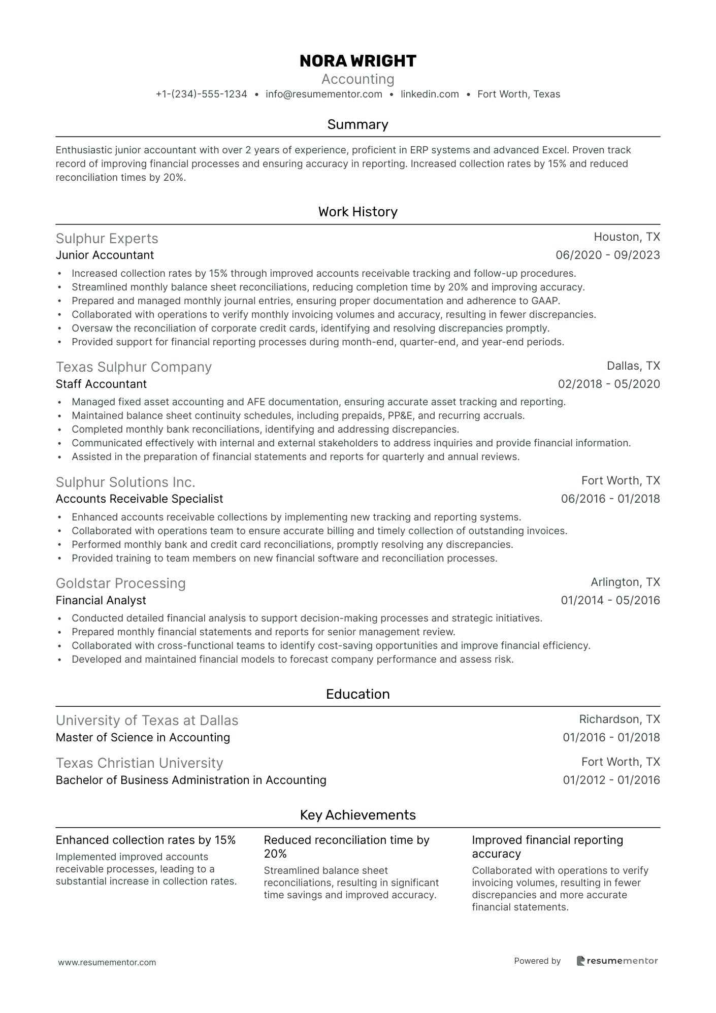
Basic resume template
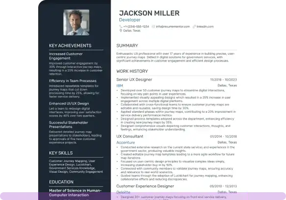
Showcase your work history and skills in a digestible way with a basic resume template. If you’re looking for a classic style that effortlessly conveys information, look no further. Featuring plenty of white space and a straightforward structure, this is a popular template that hiring managers will love.
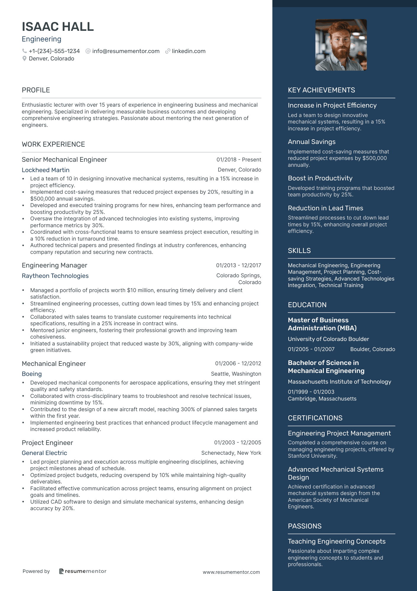
Two-column resume template
If you have a lot to shout about, the two-column resume template may be the answer. This unique structure allows you to share a wealth of information on a single-page document. The slick design is ideal and professional while also giving you the flexibility you need.
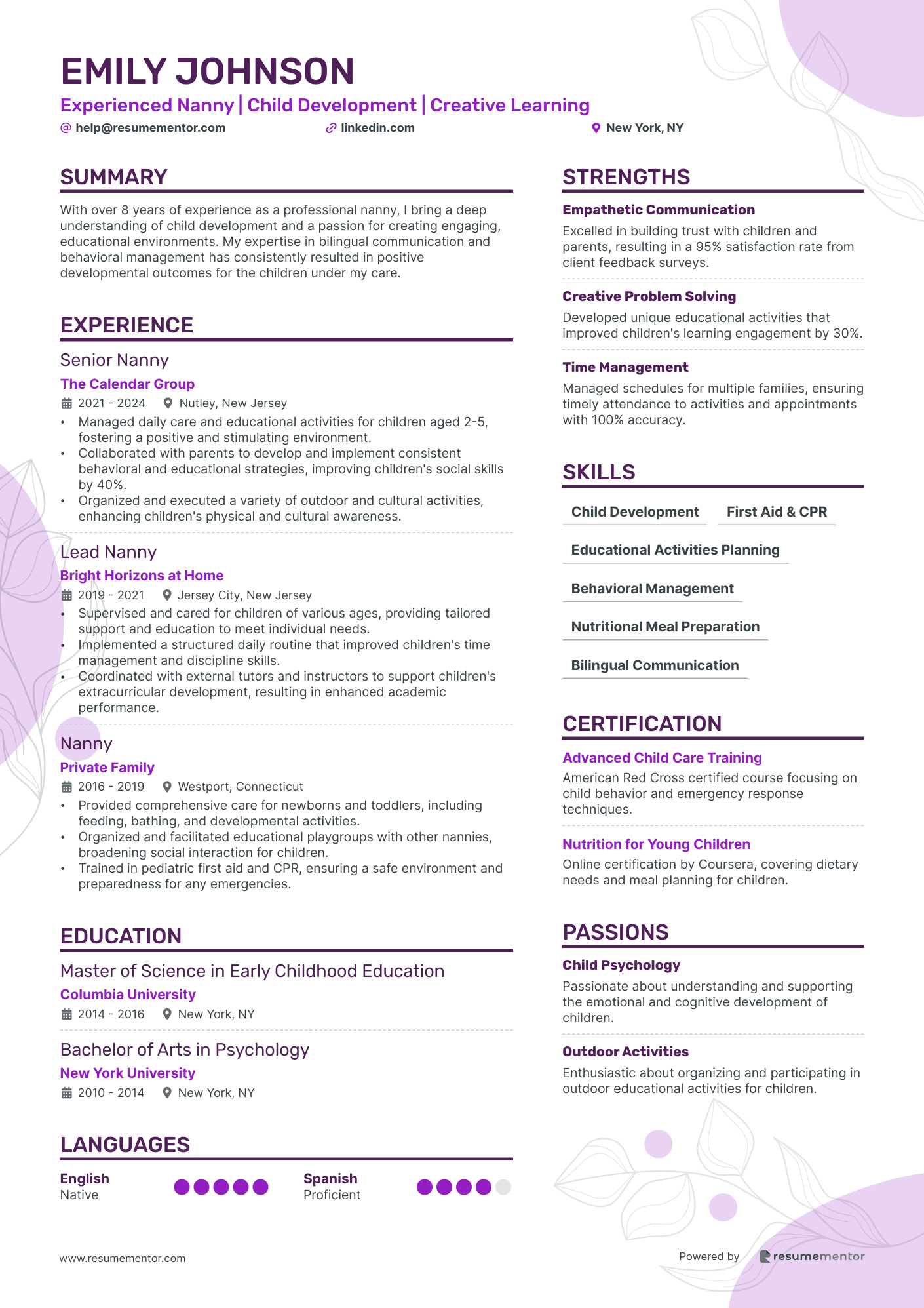
Creative resume template
Working in a creative field? Whether you’re a photographer, model, illustrator, or designer, you have to check out our creative resume template. The design is ideal for highly creative professionals who want to add a flair to their existing applications. Stand out from the crowd now!
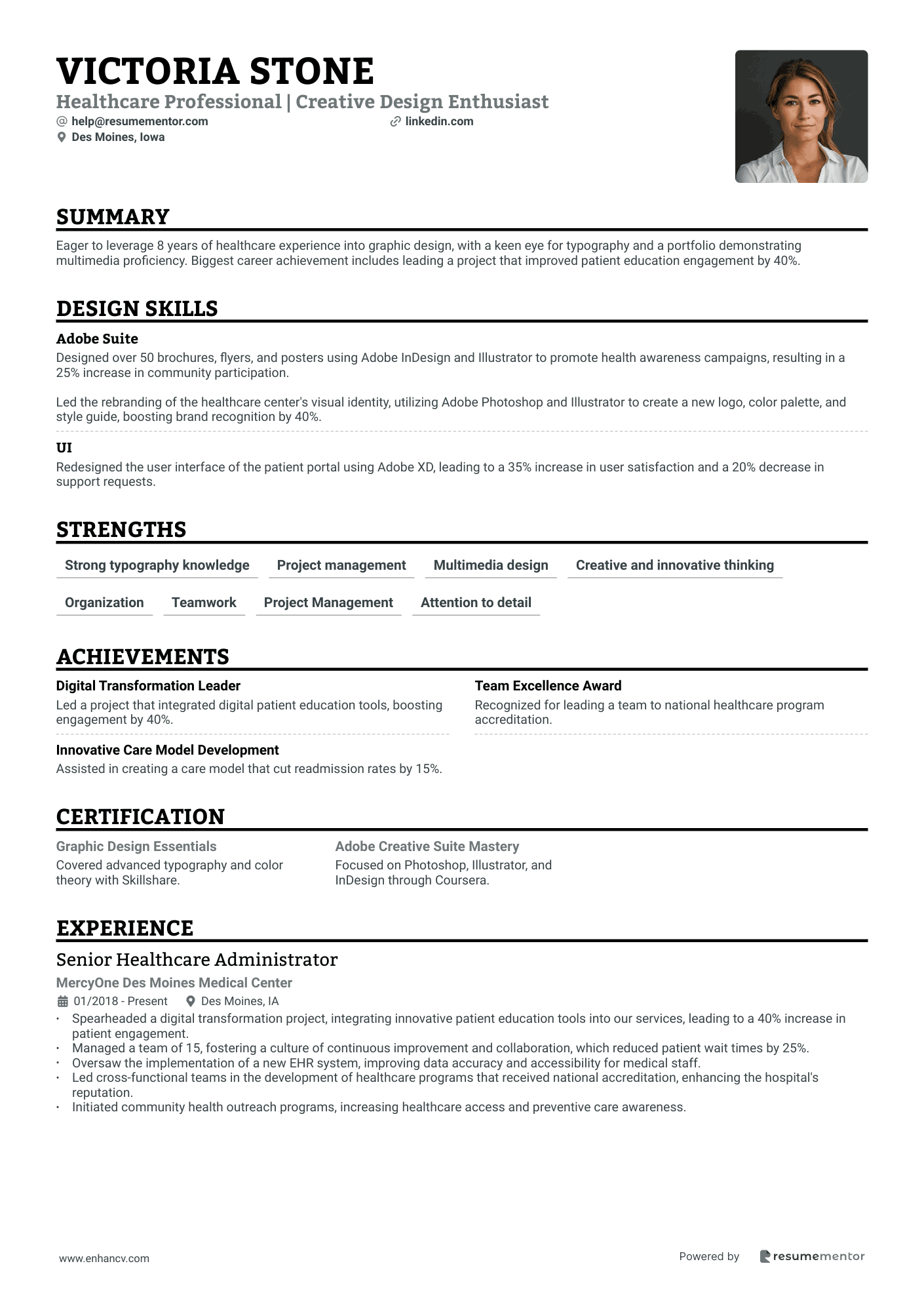
Simple resume template
There’s no sense in trying to reinvent the wheel. Whatever job you’re applying for, it’s well worth looking at our simple resume template. Create a straightforward structure that will appeal to any hiring manager. With perfectly formatted margins, plenty of space, and clear sections, there’s a lot to take in here.
What’s the best resume format?
The so-called “best” resume format depends on your specific needs as a candidate. Before you choose the right format for you, you should consider what part of your application you want to highlight.
Eachformat puts the spotlight on a different aspect of the application.
Let’s recap each one and when you might use it:
- Reverse chronological resume format This is best for professionals with a linear career history who want to climb the career ladder.
- Functional resume format This approach is perfect for career changes, professionals with an inconsistent work history, freelancers, and consultants.
- Combination resume format: Finally, the combination approach is ideal for professionals with both a solid work history and a specialized skill set.
Use the above as a guideline. However, since there are many different types of applicants out there, you cannot use a one-size-fits-all approach.
What’s the best resume format to beat the ATS?
Contrary to what you may have heard, the resume format does not impact the ATS ranking. Don’t believe the hype. The truth is that 99% of resumes are rejected by recruiters, not ATS software. The system organizes incoming resumes and delivers them to the decision-maker. It doesn’t disqualify applicants.
Trying to format your resume for the ATS is a mistake. Instead of worrying about “bots,” you should consider what format recruiters love. Since the reverse-chronological format is the traditional approach, this is the best resume format for most cases.
Frequently asked questions about resume formats
What’s the recommended resume format for high school/college students?
Is the resume format the same as the resume template?
What’s the difference between resume format and resume formatting?
What are all of the resume formats?
In this article, we have covered the three best resume formats. However, there are many different types of structures that you may consider. Here’s a list of all of the resume formats:
- Reverse-chronological resume format
- Functional resume format
- Combination resume format
- Infographic resume format
- Targeted resume format
- Resume format with a profile
When choosing the right resume format, decide what part of your application is the strongest. You can then select a structure that highlights this aspect of your professional history.
Key Takeaways
- Boost your chances of success by selecting the best resume format for your application.
- Consider which format aligns with your work history and level of expertise.
- Don’t believe the hype—99% of resumes are rejected by people, not the ATS.
- Use our free resume templates now to make the creation process a total breeze.
Related Articles
Continue Reading
Check more recommended readings to get the job of your dreams.
Resume
Resources
Tools
© 2026. All rights reserved.
Made with love by people who care.
