How to Choose the Best Resume Layout in 2025

Sep 18, 2024
|
12 min read
Use our guide to figure out the best resume layout for you.
Perfecting your resume content is one thing, but it could all be in vain without the right resume layout. The way you structure and organize this document matters more than you think. The aim of the game is to make it visually appealing and serve up the information in a simplified way. If you get that right, you can make a strong first impression on the hiring manager.
Key takeaways for selecting a resume layout
- Selecting a good resume layout is the foundation of success. Don’t miss out on the opportunity to make the right first impression.
- Identify which type of resume layout you need, depending on your position and/or sector.
- Use plenty of white space throughout your resume and ensure your resume sections are clearly labeled with headers.
- Select a legible, classic font and get the sizing right. The easier your resume is to read, the better your chance of success.
- Avoid the common pitfalls we outline later in this guide to ensure your resume layout hits the mark.
Luckily, you don’t have to be a graphic designer to create a simple CV layout. In the following guide, we’ll share everything you need to know about how to structure this document like a pro.
Is your resume good enough?
Drop your resume here or choose a file.
PDF & DOCX only. Max 2MB file size.
What is a resume layout?
Before we get down to it, you might be wondering what a resume layout is. Put simply, this is the structure you use when organizing your resume. It includes the sections that you’ll have along with formatting features, such as how many columns you have.
Here are the core elements that make it up:
Resume layout features
- Header: This is the resume section that includes your basic contact details. Your resume layout determines where it sits—at the top or side—of your document.
- Sections: The resume layout you choose will help you decide where to place certain sections of the document and how much emphasis to put on each of them.
- Spacing and margins: Proper spacing increases the readability of your resume. When you’re preparing the layout, decide whether to use standard margins or custom margins.
- Font size: Next up, the layout may influence the font size you choose.
- Columns: While two columns is the standard approach, different resume layouts exist.
It’s important not to confuse the resume layout with the resume template. These are two different things. While the layout informs how you structure the document, the template is a predefined design that you can edit. Each one has their place but they aren’t the same thing!
Check out our stylish template below:
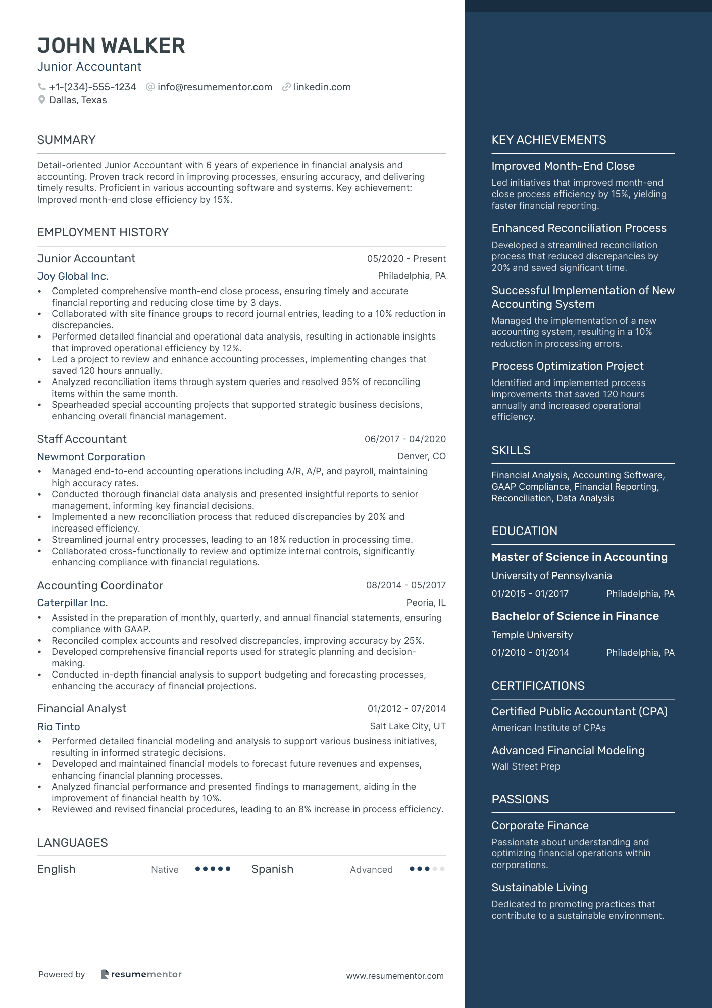
What are the different types of resume layouts?
Now that you understand what a resume layout is, let’s dig deeper. So you can choose the perfect layout for your resume, you need to know about the options.
Here’s a breakdown of the most common choices:
Traditional layout
A traditional resume layout is the standard structure employers expect to see. It’s most effective when you’re applying for traditional roles, such as teaching, nursing, law, and banking.
It includes the following:
- Resume header (contact details)
- Resume summary
- Work experience
- Education
- Skills
- References (optional)
The major benefit of this resume layout is that it’s predictable. The hiring manager will know exactly what they’re getting when they glance at your resume, making it easier for them to understand.
Take a look at a traditional resume layout template below:
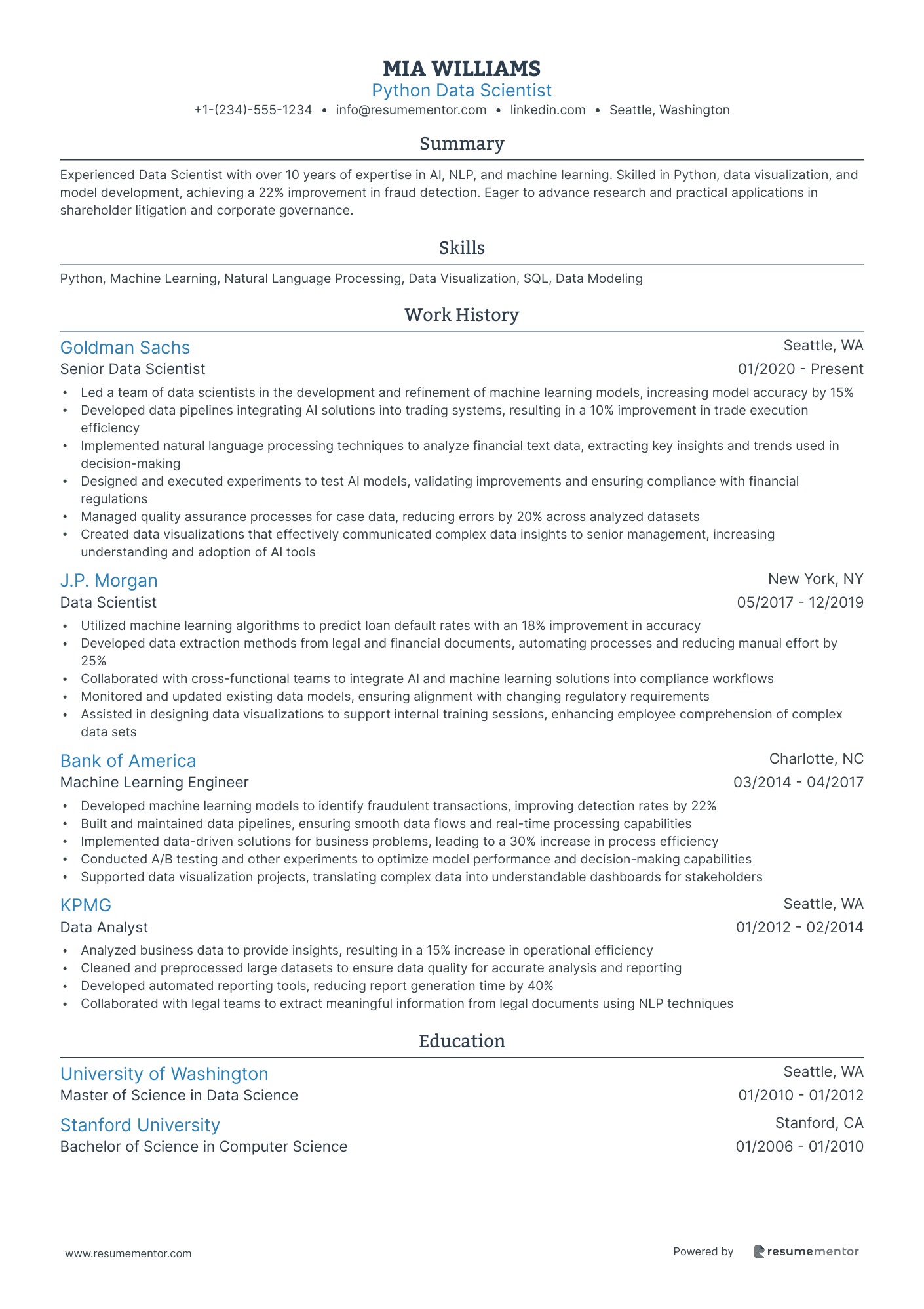
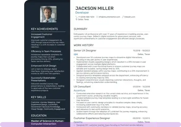
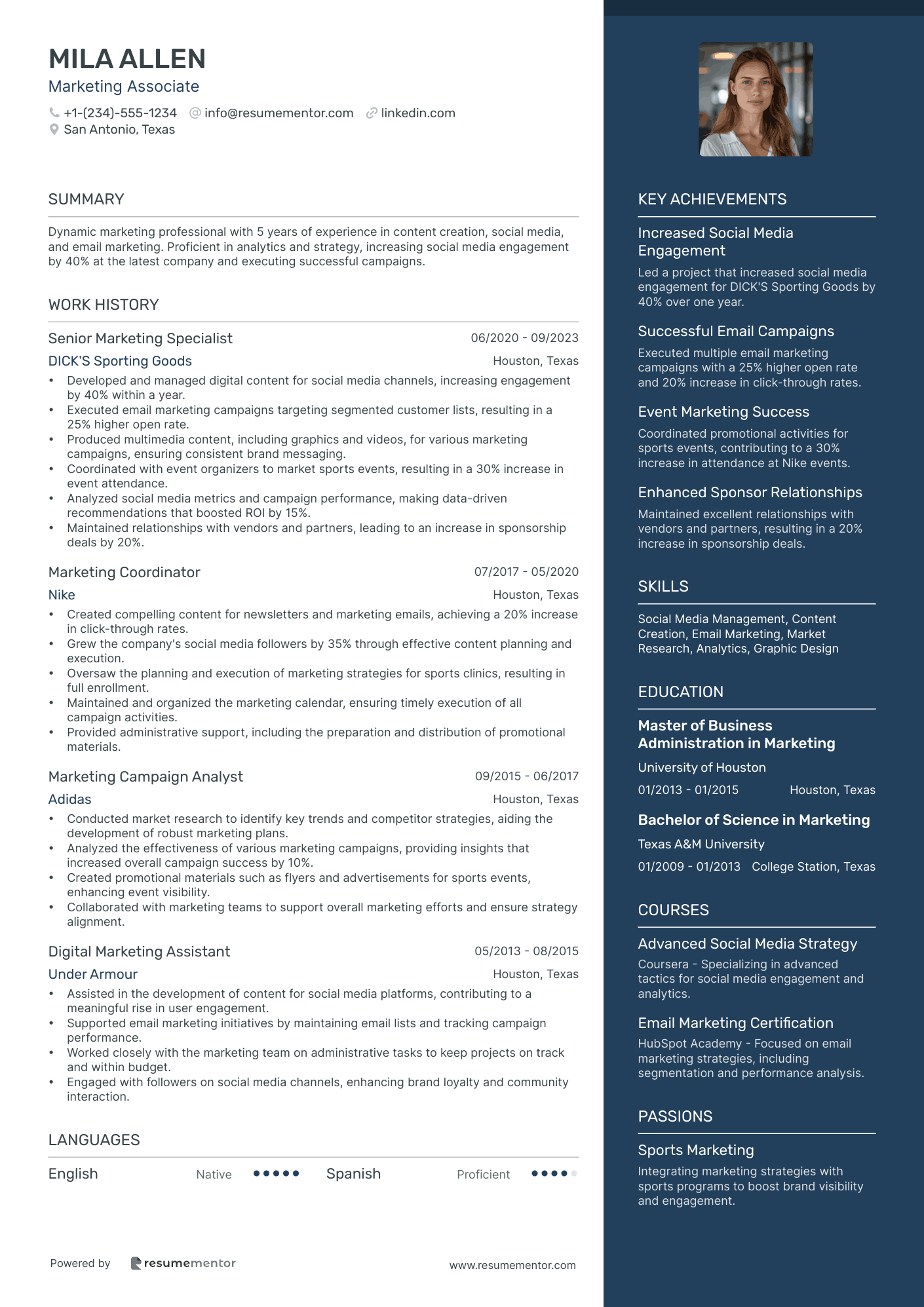
Modern layout
Looking to land a creative role? You might find that a modern layout suits your application. While this resume layout often follows the same structure as the traditional one, there are some key differences.
For example, the layout may include extra sections, such as key achievements or passions. Equally, the style is likely to be modern, including contemporary font styles or more eye-catching headers.
If you want to give your next resume extra flair, choosing a modern layout is the answer.
Take a look at a modern resume layout template below:
Professional layout
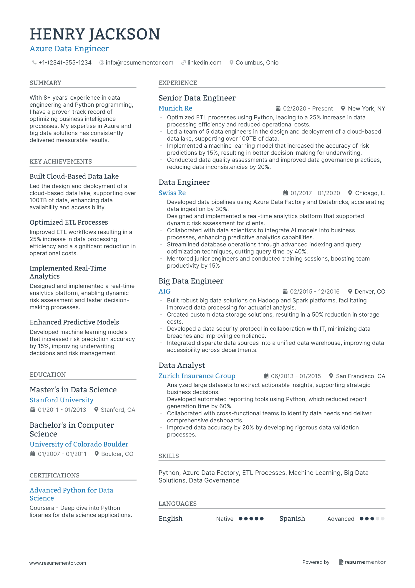
Setting your sights on a top role? When you’re applying for corporate positions, it’s vital you use a professional resume layout. It has a clean and organized structure that packs in lots of detail. Since you’ll have loads of info to share, getting the structure right is a must.
Often enough, this layout boasts a two-column structure with either equally weighted columns or a sidebar. Ensure there’s plenty of white space and properly spaced-out margins. That way, the hiring manager should have no problem reading the content of your resume.
Take a look at a professional resume layout template below:
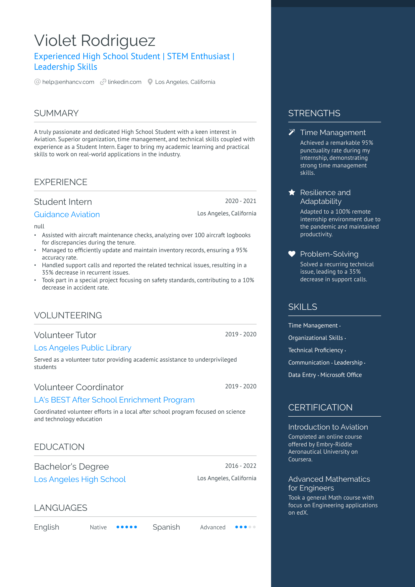
Student or entry-level layout
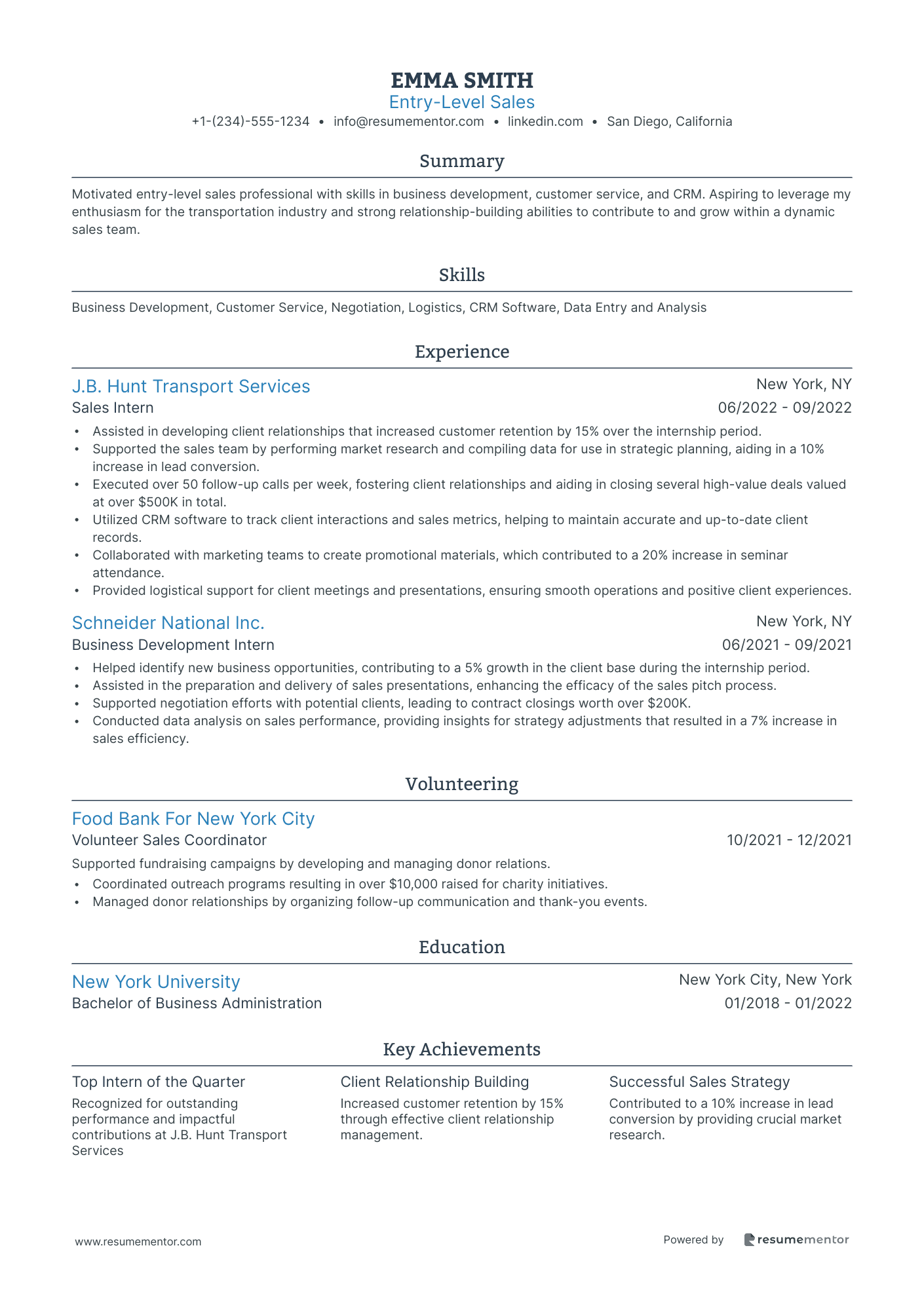
When you’re new to a sector or, indeed, the working world, you won’t have a ton of experience. Luckily, there’s a way you can emphasize your skills over your experience. Using the student or entry-level resume layout is the answer. For this, you should adopt a functional format.
This is the perfect resume layout for newcomers. It groups your experiences (or, for example, projects) into different skills or competencies. When the hiring manager looks at your resume, they can quickly and easily see what talents you have. The layout also places your education front and center.
Take a look at a student or entry-level resume layout template below:
Resume layout best practices
Whichever resume layout you choose, there are some best practices you need to follow.
Before you start creating your resume, check out our basic guidelines:
Simplicity is your number one priority
Above all else, make sure your resume layout is simple. Overcomplicated structures will do more harm than good. Your goal is to ensure the hiring manager can quickly and easily read your resume.
If you make it difficult for them, you might lose out on potential interview and job opportunities. Stick to a clean design that highlights your value, experience, and skill-set in a straightforward manner.
Include plenty of white space
Trying to cram too much information onto your resume is a mistake. If you don’t have enough space between each section—and in the margins—your resume will be hard to read. Ensuring you use an even amount of white space between sections makes your document easy to read.
Always use readable fonts
The fonts you choose will impact how easy it is to read your resume. Classic options include Times New Roman, Arial, Calibri, and Helvetica. These fonts are professional and easy to read.
However, if you want to mix things up, there are other options you can consider. For instance, modern fonts such as Rubik, Montserrat, and Volkhov boast a similarly formal vibe for resumes.
What size font should you use?
As a general rule, your resume body content should be in 12 pt font size. However, if you’re struggling to fit in all the information you need to share, drop this down to 10 pt.
Create clear section headers
The headers separate and label your resume sections. To help them play that important role, you need to make sure they’re 100% clear to the reader. Once again, you should choose a font style that suits your resume. Go for either 14 or 16 pt as this needs to be larger than the body content of your resume.
Include bullet points and lists
No one wants to be confronted with a wall of text, least of all the hiring manager. Use bullet points and lists to share a load of information in a quick, easy way. You should include these in your work experience section, for example, below the basic details about each position you’ve held.
Resume layout examples to inspire you
Ready to get started and create an interview-winning resume? We have a selection of resume layout examples to give you some creative motivation.
Let’s take a look at some common professions:
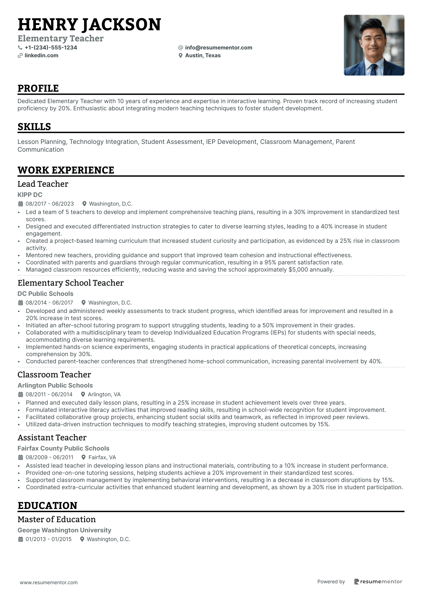
Teacher resume layout
Teaching is a traditional role, and so we recommend using a traditional resume layout. This approach will highlight your teaching experience while balancing your strengths and educational feats.
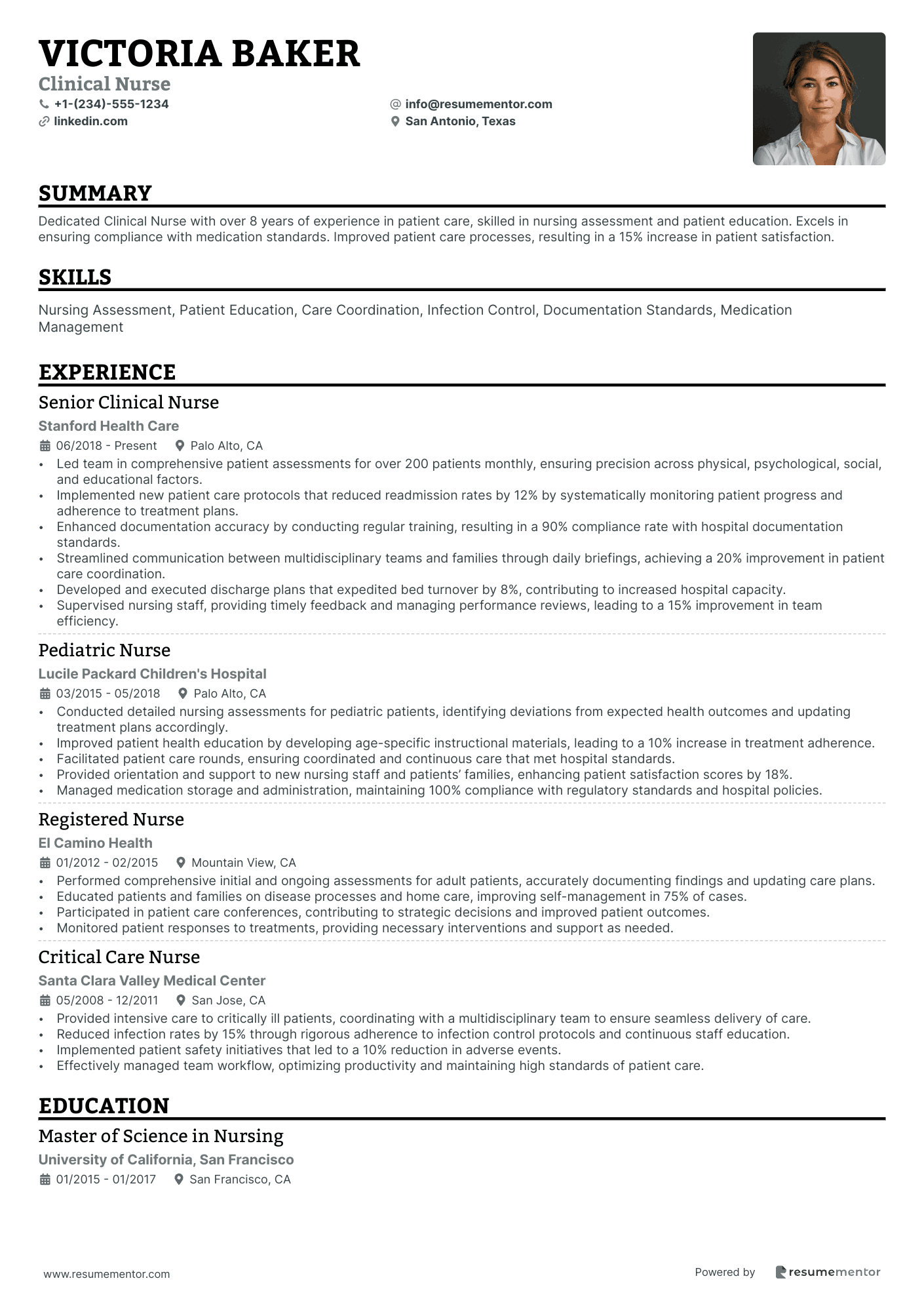
Nurse resume layout
Similarly, nursing—or any healthcare profession—falls into the traditional realm. With that in mind, use a structure that speaks to this. Follow the chronological order and emphasize your work history.
Resume layout for student
As we’ve mentioned, when you lack work experience, you should use a functional resume format. This structure puts more focus on your skills and education than it does your lack of work history.
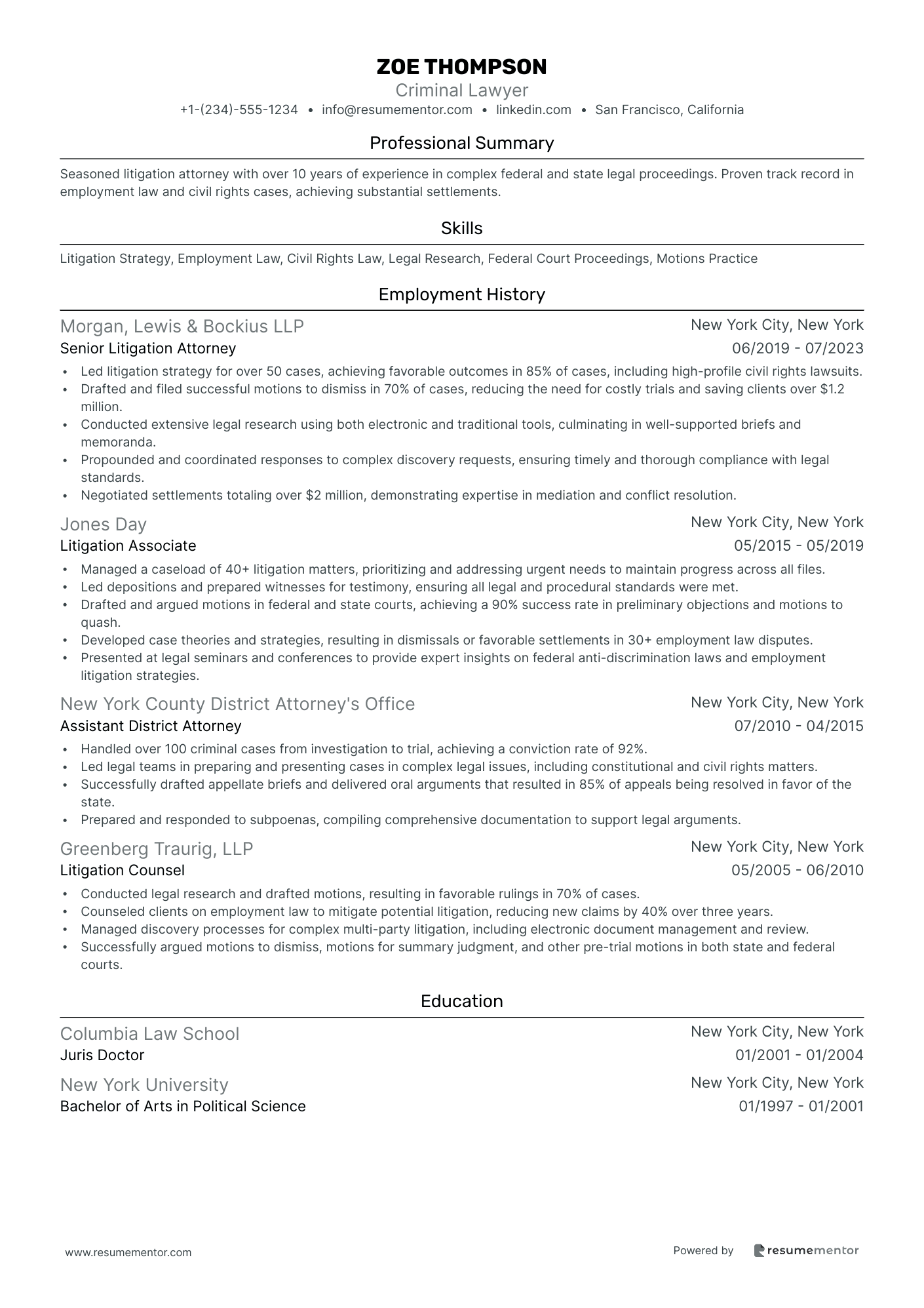
Lawyer resume layout
Law is a highly competitive and traditional field. As such, the proper resume format here is a traditional one. Outline the work experience you have clearly while also including your competencies and education. You might want to slide in a key achievements section if you have notable feats to shout about.
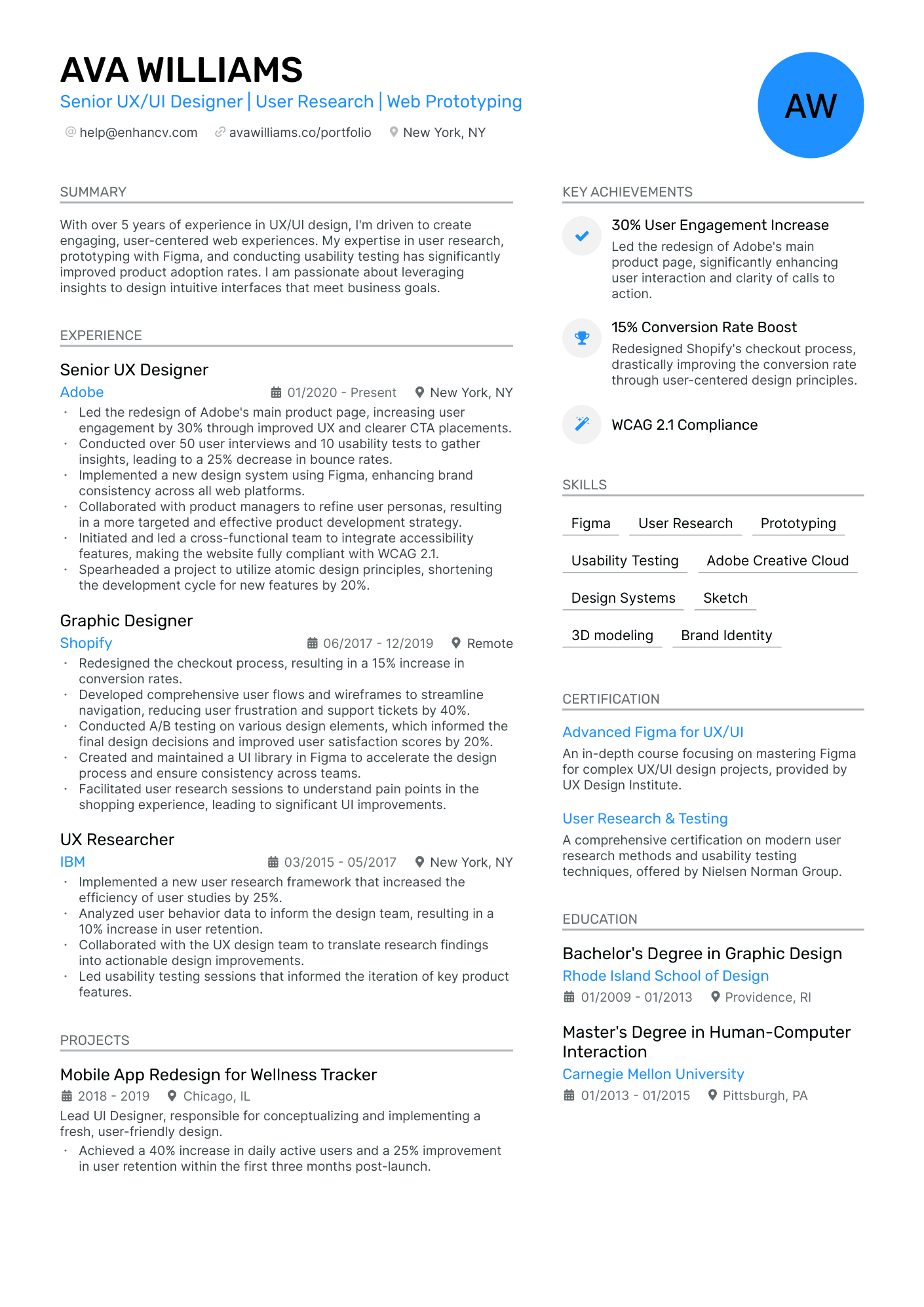
Designer resume layout
Applying for a graphic designer or interior designer role? You can afford to add more creativity into the mix. We recommend using a modern resume layout that includes additional features. Remember, your resume doesn’t have to be heavily designed. Keep it simple and easy to read.
Mistakes to avoid for a good resume layout
By this point, you should be feeling pretty confident about choosing the right resume layout.
Before you dive in, make sure you avoid the common pitfalls below:
Resume layout mistakes
- Cluttered design: The design you choose should be simple and easy to read. Ensure there’s plenty of white space around the sections and in the margins.
- Inconsistent formatting: Whatever format you choose, make sure it’s uniform. Small differences are easy to detect and can detract from your resume.
- Chaotic font styles: It doesn’t matter how remarkable your resume content is if the hiring manager can’t read it. Pick a standard font style that’s easily legible.
- Too many design elements: Including too many design features on your resume is a recipe for disaster. Keep them to a minimum for a more classic structure.
How to structure your resume for ATS
Some employers use Applicant Tracking Systems (ATS) to vet incoming resumes. However, contrary to what you may have heard, the bots aren’t the ones rejecting your resume. The hiring manager will have the ultimate say on whether you get offered an interview or not.
Still, for the best chance of success, it’s worth tailoring your resume layout to meet the software’s needs. Making your resume ATS-friendly isn’t rocket science. You can do this by including keywords relevant to the job (you can find these in the job description!). You should also avoid using images or graphics, and keep the formatting simple. Choose a standard resume layout for the best results.
In conclusion
Selecting the proper resume format for your next application is a no-brainer. No matter what job you’re applying to, the hiring manager will expect a clear and concise structure that ticks all of the boxes.
Follow the advice we’ve shared in this guide to review or revise your existing resume. Alternatively, you may want to start from scratch and use our examples for inspiration when designing your resume layout.
Use our intuitive resume builder to quickly and easily create an attractive resume optimized for ATS. The tool has features including content suggestions, professionally selected fonts, and resume tailoring.
Related Articles
Continue Reading
Check more recommended readings to get the job of your dreams.
Resume
Resources
Tools
© 2026. All rights reserved.
Made with love by people who care.
