Resume Margins: How to Set Them for Easy Readability

Sep 18, 2024
|
12 min read
Precise resume 1-inch margins for the perfect format. Set the exact size and adapt it to your industry.
Job candidates often overlook one minor detail that can make or break their resume: margins. If ignored, your resume might appear cluttered or have too much empty space, giving a messy and unprofessional impression.
Want to know how to make your resume look professional and compatible with Applicant Tracker Systems (ATS)? The secret lies in the resume margins.
The right margin size ensures your resume is organized, easy to read, and visually appealing.
Think of your resume margins as the frame around your career’s portrait—essential for your presentation.
Key Takeaways
- Proper resume margins create a professional presentation of your experience, enhancing readability and guiding the recruiter’s eye through your content.
- Standard margins of 1 inch are recommended, but you can adjust them between 0.5 and 1 inch based on content.
- Margins should balance white space and content, ensuring your resume is neither cluttered nor sparse.
- Adjust your margins depending on the industry and role you're applying for, but prioritize clarity and legibility above all.
- Use online tools to review your resume for both digital and print formats to ensure consistency and readability.
What is the standard margin size?
The standard resume margin size is one inch on all sides, providing plenty of white space and creating a balanced and clean look. This spacing allows for essential information, like your name and contact details, to be prominently displayed without overcrowding the page.
PRO TIP
If you need more space for content, you can adjust your resume margins within a range of 0.5 to one inch. However, avoid going below 0.5 inches, as this can compromise readability and make your resume appear cluttered and difficult to read.
The standard margin ensures consistent formatting both on-screen and in print. This is particularly important since some recruiters may print out your resume or request a physical copy.
The one-inch margin helps prevent content near the edges of your resume from being cut off.
Why are your resume margins important?
Your resume’s formatting and design can significantly impact whether it catches a recruiter’s eye or gets overlooked. Recruiters often disregard resumes that appear too empty or messy, making margins crucial in shaping the overall appearance of your resume.
Proper margins enhance readability and ensure that important information stands out, helping your resume look polished and professional.
Here are six reasons why your resume margins matter:
- Readability: A one-inch margin all around guides the reader’s eye, highlighting key information and providing space for note-taking.
- Aesthetics: Well-set margins improve your resume's visual hierarchy, creating a strong first impression.
- Professionalism: Neatly formatted margins convey you're organized and serious about the opportunity, which can positively influence hiring decisions.
- Optimizing space: Adjusting margins helps you balance content and white space, preventing both overcrowded pages and empty gaps.
- Relevancy: If you’re shrinking margins to fit more content, consider if all the details are necessary.
- Consistency: Using conventional margins ensures your resume aligns with standard expectations, keeping the focus on your content.
Who are resume margins important for hiring managers or the ATS (the software companies use to scan applications)?
There’s a common myth that the ATS evaluates resumes based on margins, but this isn’t true—it focuses on processing and sorting resumes based on content, not formatting.
However, margins and overall visual appeal are actually important for human readers, as they set the tone for how your profile is viewed.
How to customize your resume margins for different industries
Now that we've covered the basics and importance of resume margins, let's consider whether there are specific rules for different industries.
And yes, certain resume formats can be more beneficial depending on the role you're applying for.
Resume margins for traditional industries
In fields such as law, finance and accounting, engineering, healthcare, and academia, it's best to use a traditional resume design.
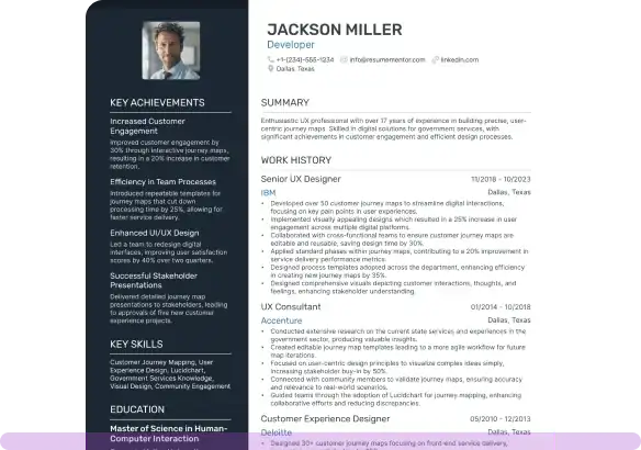
The standard layout typically features a single column with minimal graphic elements and one-inch margins, which offer enough space between the text and the page edge.
However, there are exceptions. If your resume includes sections like publications, presentations, or research projects, you can reduce the margins slightly (down to 0.5 inches) to fit everything in.
PRO TIP
You've likely heard of the one-page rule, which suggests keeping resumes to a single page unless you have over a decade of experience.
Don't feel bound by the rule —instead, focus on maintaining your resume’s clarity and structure, ensuring it’s legible and relevant rather than trying to fit everything onto one page.
Resume margins for creative industries
Working in marketing, graphic design, advertising, or a similar creative field? You might be tempted to go all out with a unique, personalized resume design—but this is often unnecessary.
Even for creative roles, hiring managers generally prefer simple resume formats with standard margins between 0.5 and one inch.
Remember, that recruiters are ultimately trying to understand if your experience matches the role. They don't have the time to figure out elaborate layouts, and not all of them will appreciate your design choices.
Common creative resume formatting mistakes
Avoid fancy formatting in your resume, which includes:
- using graphic design elements or text in the margins.
- hiding QR codes in your resume margins.
- excluding your margins entirely.
While you can add a creative touch, ensure that your resume's readability comes first. If you want to experiment with design, consider subtle colors that complement your layout or a graphic that reflects how you spend your time.
Just be sure that any creative elements enhance, rather than distract from, the presentation of your expertise.
C-Suite tip
For executive-level roles, especially C-suite or for those with over a decade of experience, your resume design should align with the expectations for the high-level positions.
We recommend using either:
- One-inch margins, extending your resume to two pages, to ensure your extensive career history and accomplishments are presented in a well-organized, easy-to-read format.
- 0.5-inch margins to fit everything on one page while still maintaining a polished and professional look.
Step-by-step guide to setting up resume margins
Adjusting your resume margins is entirely based on the software you're using. Find out the steps to setting up your margins in ResumeMentor, Microsoft Word, Google Docs, LibreOffice Writer, and iWork Pages.
Set up your resume margins in ResumeMentor
ResumeMentor offers templates designed for readability, ensuring that margins never fall below 0.5 inches, even if you try to change them manually.
Our resume builder provides five adjustable margin sizes using a simple drag-and-drop function, allowing you to modify white space and content easily.
We also take care of text alignment and line height, automatically adjusting them to suit your chosen margins.
To modify the margins in ResumeMentor:
- Go to “Design & Font.”
- Use the “Margins” slider at the top of the dropdown menu to adjust the margin size.
From the same tab, you can also change font, size, and color.
Adjust your resume margins in Microsoft Word
Let's start with the good news—by default, Microsoft Word sets one-inch margins on each page.
Word also offers extensive formatting options, so you can adjust your resume margins on your own, which is pretty straightforward:
- Open your document and click the “Layout” (or “Page Layout”) tab in the ribbon.
- Select “Margins.”
- Choose a preset margin size (e.g., “Normal” for one-inch margins) or click “Custom Margins” to set your own (entering the desired margin values on all sides of the document).
- Enter your desired margin sizes and click “OK.”
You can also adjust margin units by going to “File” > “Options” > “Advanced” > “Display” > “Show measurements in units of”.
Changing your resume margins in Google Docs
The default margins in Google Docs are also set as one inch. But if you want to edit the design, the process is pretty simple:
- Click “File” at the top of the screen.
- Select “Page Setup”—this allows you to also edit the page orientation, paper size, etc.
- In the "Margins" section, manually enter your desired values (e.g. "1") for top, bottom, left, and right margins.
- Click "Set as Default" to use these margins for future documents.
- Then select "OK" to apply the changes.
Alternatively, you can adjust margins directly using the ruler at the top of your document:
- Click "View" > "Show Ruler" (if the ruler isn’t visible).
- Place your cursor at the beginning of the paragraph and go to the ruler.
- Drag the blue triangles on the ruler to modify the left and right margins.
- Ensure the gray part of the ruler is untouched.
PRO TIP
In Google Docs, the ruler's measurements depend on the language setting in your Google Account. If you've selected English (United States), then the unit will be in inches.
Setting your resume margins in LibreOffice Writer
Adjusting your margins in the free text editor, also known as OpenOffice, is pretty easy:
- Click “Format” at the top of the screen.
- Select “Page Style” from the dropdown menu.
- In the "Page" tab, enter your desired margin sizes under the "Margins" section.
- Click "OK" to save the changes.
Adjusting your resume margins in iWork Pages
For iWork Pages, follow these steps:
- Open your document and click the "Document" button on the right side.
- In the "Document Margins" section, input your desired margin sizes or use the arrows to adjust them.
Beyond margins: comprehensive resume formatting
Congratulations—you've now set up your resume margins. Here are three additional elements you need to consider throughout your resume design.
Font (style)
Font choice is linked with your resume’s legibility—select a simple, recognizable serif or sans-serif font (such as Lato, Rubik, or Bitter).
Combining two complementary fonts helps establish a visual hierarchy and guides the reader through your resume.
Font size is typically between 10 and 12 pt for content, while section headings can be larger (up to 14 pt). Prioritize readability over squeezing content onto one page.
Text alignment
For a clean, professional look, align your resume text to the left. This applies to section titles, bullet points, and content, ensuring an easy-to-follow structure.
Left alignment is standard for formal documents and allows readers to quickly scan important details such as job titles, dates, and education.
While the left alignment is ideal for most content, you may choose to center your name and contact information at the top of your resume or align dates to the right for balance.
Paragraph spacing
Adequate white space between sections makes your resume more scannable and visually appealing.
A general guideline is to use 1 to 1.15-point line spacing for normal text and double-spacing for section headings. This prevents your resume from appearing too cluttered.
You can also use single spacing with extra space between sections to guide your reader smoothly from one section to the next.
Be consistent!
Consistency is crucial for a cohesive design. Ensure uniformity across all formatting elements, from font sizes and styles to paragraph spacing, alignment, and resume margins. This attention to detail conveys professionalism and makes your resume easier to read.
Advanced tips for resume presentation
Let's have some more fun with your resume design!
Check out three additional styling tips:
- Use colors sparingly: You don't want your resume to look like a Picasso painting, so use colors thoughtfully. For instance, limit the use of color to your name and section headings. Too much color can overwhelm and distract from the content.
- Maintain consistency: Ensure uniformity in design elements throughout your resume. This includes headings, date formats, bullet points, and font sizes.
- Avoid complex graphics: Steer clear of images, tables, or intricate design elements. Instead, stick with standard circular bullet points to maintain readability.
Check the format!
Test your resume in digital and printed formats to ensure consistency in appearance, alignment, and margins.
My resume is less than a page, how can I adjust its margins?
While it's okay to slightly increase your margins, it's better to add relevant content to fill the space. Consider expanding sections or including academic projects and achievements if applicable.
Can I use justified text on my resume?
No, it's best to left-align your text. Justified text can create uneven spacing, making it harder to read your resume and less visually appealing.
Should I put my name and contact details in the margins to save space?
Avoid placing important information like your name and contact details in the margins. Use the header to make a strong, professional impression.
Conclusion
While margins may seem like a small detail, they play a vital role in how your resume is perceived. Maintaining the standard one-inch margin creates a clean and professional look that hiring managers appreciate, while also ensuring your resume is easy to read both on-screen and in print.
By using proper margins, you'll leave a positive impression on recruiters, without distracting them with clutter or poor formatting.
Related Articles

Continue Reading
Check more recommended readings to get the job of your dreams.
Resume
Resources
Tools
© 2026. All rights reserved.
Made with love by people who care.